HTML layouts divide a web page into structured sections for better organization and styling. They improve readability, accessibility, and overall user experience.
Semantic Structure: Uses elements like <header> , <nav> , <main> , <article> , <section> , <aside> , and <footer> . Better Organization: Helps arrange content clearly, making pages easier to manage. Improved SEO & Accessibility: Enhances search engine understanding and user accessibility. Syntax:
<header> Content... </header>
<nav> Content... </nav>
<main> Content... </main>
<footer> Content... </footer>
<header> contains the main heading of the page. <main> holds the primary content. <footer> includes the footer information. Layout Components HTML layouts divide a webpage into structured sections for better organization and readability.
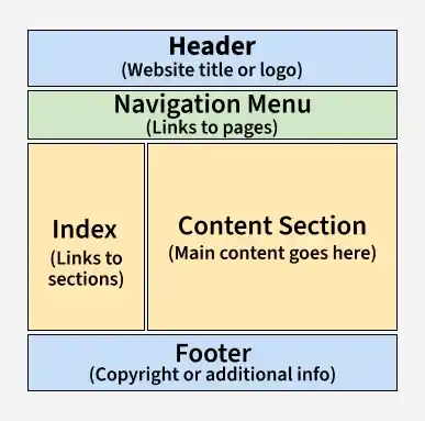
👁 html4 Header: Top section with title, logo, or links using <header>. Navigation Bar: Menu for site links using <nav>. Index / Sidebar: Side section for extra content like links or ads. Content Section: Main content area using <main>. Footer: Bottom section with info using <footer>. Example 1: Layout with Additional Semantic Tags <nav> provides navigation links for the website. <section> groups related content, here titled "Latest Posts." <article> represents an individual blog post. <aside> contains supplementary information, such as an "About Me" section. Example 2: Styled Layout with Semantic Tags Header: The <header> element contains the main heading of the page, providing a clear introduction. Main: The <main> element holds the primary content, ensuring semantic clarity and improved accessibility. Techniques for Creating HTML Layouts There are several techniques to create multi-column layouts in HTML:
CSS Frameworks (like Bootstrap): CSS frameworks like Bootstrap help speed up layout design using pre-built components and grid systems. CSS Float Property: The CSS Float Property is used to position elements, though it requires careful handling to avoid layout issues. CSS Flexbox: CSS Flexbox is used to create responsive and dynamic layouts by aligning and distributing space efficiently. CSS Grid: CSS Grid allows developers to create complex two-dimensional layouts with better control over element placement. Best Practices for HTML Layout Follow these practices to create clean, structured, and responsive web page layouts.
Keep layout simple and clean by avoiding deeply nested elements and unnecessary divs. Use CSS for styling and positioning instead of relying on HTML structure for layout design. Ensure responsiveness by designing layouts that adapt well to different screen sizes using flexible units and media queries. 