 |
VOOZH | about |
|
VOOZH | about |
Gradients are smooth transitions between multiple colors, offering a visually appealing and modern way to design elements. In HTML, gradients are typically applied using CSS.
We will discuss the different approaches to making gradient buttons in HTML:
Table of Content
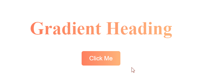
A linear gradient creates a transition between colors along a straight line. The most basic way to create a gradient button is by using the background property with linear-gradient().
Example: Below is an example of making a gradient button in html using a linear gradient.
Output:
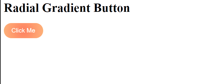
A radial gradient gives a circular or elliptical color transition, starting from the center (or a specified point) of the button. In this case, radial-gradient() is used to create a circular gradient effect. The colors transition from the center outward, giving the button a dynamic look. The button also has a hover effect that slightly enlarges it.
Example: Below is an example to make a gradient button using radial gradient button.
Output:
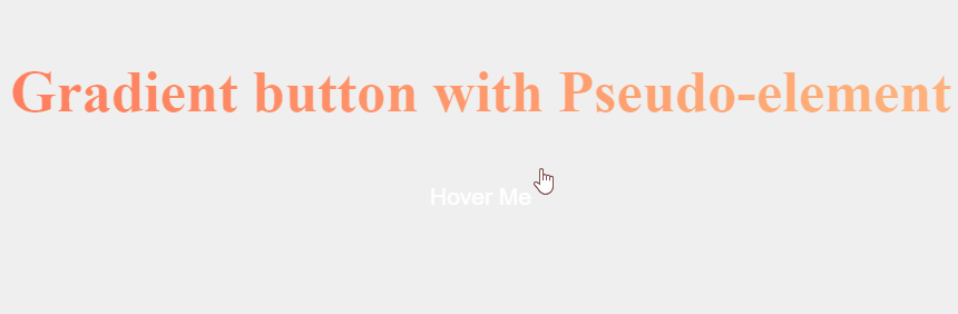
Another approach is to use pseudo-elements (::before or ::after) to create a gradient effect. This allows you to create more complex designs or add animations. In this case, we use the ::before pseudo-element to create the gradient. The ::before element is initially hidden using transform: scaleX(0), and on hover, it expands to cover the entire button, creating a smooth gradient transition effect.
Example: Below is an example to make gradient button in html with pseudo-elements:
Output: