 |
VOOZH | about |
|
VOOZH | about |
HTML Input Element has various types that play an important role in creating HTML Forms, and the element is efficient in collecting user data and adding interactivity to web pages. These elements provide the feature to create an interactive web page. In the Input Element, there is an attribute type having different values that help to create the form according to the requirements of the web page. The default value of type is "text" in the input element. The input elements can be customized by applying CSS to them and the elements can also be manipulated dynamically with JavaScript. Below is the list of various Input Types with their basic illustrations.
Table of Content
We will explore each of them with their basic implementations.
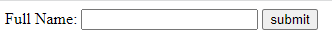
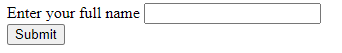
This type facilitates short, straightforward text input for capturing simple information like names or comments.
Example: The example illustrates the input type text.
Output:
This type ensures secure data entry by hiding characters, commonly used for password inputs.
Example: The example illustrates the input type Password.
Output:
This type triggers the submission of form data and allows the transfer of entered data to a server.
Example: The example illustrates the input type submit.
Output:
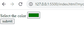
This type opens a color picker, simplifying the selection of preferred colors for designing of webpage.
Example: The example illustrates the input type Color.
Output:
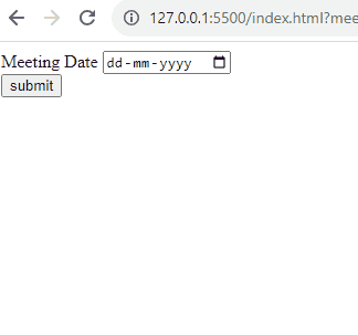
This type provides users with an easy-to-use calendar and choose a specific date.
Example: The example illustrates the input type date.
Output:
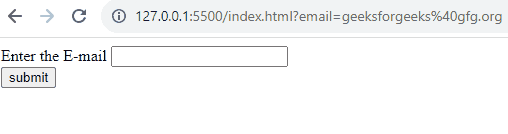
This type is basically designed for entering email addresses, ensuring the correct email format.
Example: The example illustrates the input type email.
Output:
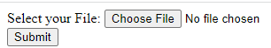
This type allows users to attach and upload files from their devices.
Example: The example illustrates the input type file.
Output:
Operating in the background, this type especially manages and stores data without user visibility.
Example: The example illustrates the input type hidden.
Output:
This type acts as a clickable image, sometimes serving as a visual trigger for form submission.
Example: The example illustrates the input type image.
Output:
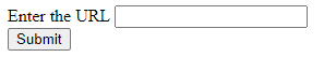
This type includes basic validation for entering accurate URLs.
Example: The example illustrates the input type URL.
Output:
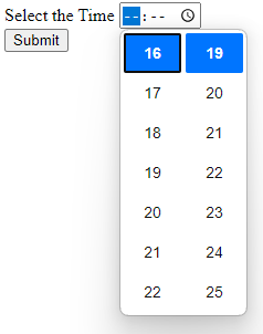
This type facilitates the selection of a specific time, sometimes used in conjunction with date inputs.
Example: The example illustrates the input type time.
Output:
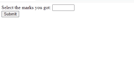
This type enables users to input numeric values, with optional constraints for specified ranges.
Example: The example illustrates the input type number.
Output:
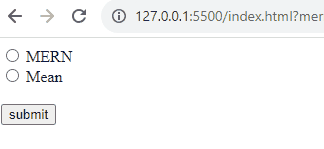
This type allows users to select one option from a set, making choices in a mutually exclusive manner.
Example: The example illustrates the input type radio.
Output:
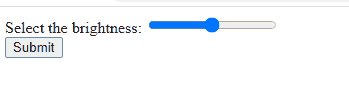
With a slider interface, this type simplifies the selection of numeric values within ranges.
Example: The example illustrates the input type range.
Output:
This type is used for Initiating a form rollback, this type basically reverts fields to their default values.
Example: The example illustrates the input type reset.
Output:
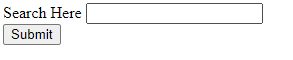
It is used for search boxes, this type encourages users to type and initiate search operations.
Example: The example illustrates the input type search.
Output:
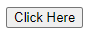
This type serves as a clickable button, often used for custom interactions.
Example: The example illustrates the input type button.
Output:
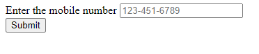
It is designed for telephone numbers, this type streamlines the input process with numeric keyboards.
Example: The example illustrates the input type tel.
Output:
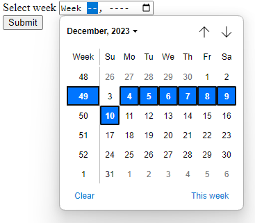
In this users can easily select a specific week within a year using this type.
Example: The example illustrates the input type week.
Output:
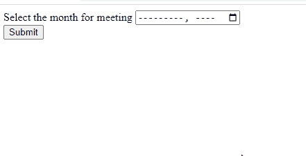
This type facilitates the selection of a specific month and year for date-related inputs.
Example: The example illustrates the input type month.
Output:
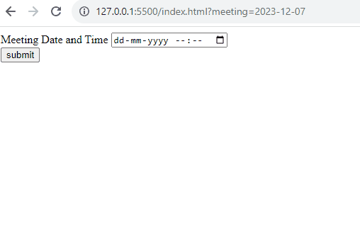
It is used to define a date and time control. The value must include the year, month, day, and time.
Example: The example illustrates the input type datetime-local.
Output:
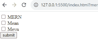
This type allows users to toggle between checked and unchecked states for straightforward decision-making.
Example: The example illustrates the input type checkbox.
Output: