 |
VOOZH | about |
|
VOOZH | about |
A game looks unprofessional if UI elements are misplaced on different screens like buttons going off-screen on mobile or text getting cut on ultrawide monitors. Responsive UI design ensures your interface looks correct on every screen size. This article covers anchors, Canvas Scaler, and safe areas.
Responsive UI means your interface automatically adjusts to different screen sizes and aspect ratios.
If you place a button at X = 500 on a 1920×1080 screen:
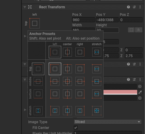
Anchors decide where a UI element sticks to the screen edges.
How to use:
Common Anchor Settings:
| Anchor | Effect |
|---|---|
| Top-Left | Stays near top-left corner |
| Top-Center | Stays centered at top |
| Top-Right | Stays near top-right corner |
| Center | Stays in middle of screen |
| Bottom-Left | Stays near bottom-left |
| Bottom-Center | Stays centered at bottom |
| Bottom-Right | Stays near bottom-right |
| Stretch | Expands to fill width or height |
1. Score Text (top-left):
2. Health Bar (top-center):
3. Pause Button (bottom-right):
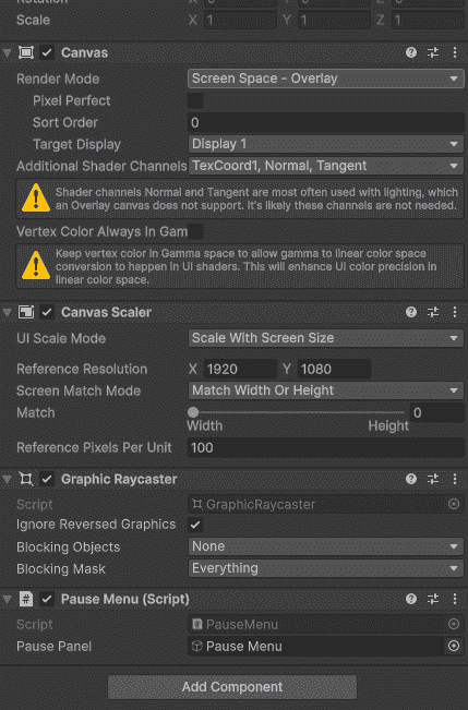
Canvas Scaler automatically scales all UI elements based on screen size.
Where to find: Select Canvas in Hierarchy - Inspector - Canvas Scaler component
Important Settings:
| Setting | What it does | Best for |
|---|---|---|
| UI Scale Mode: Constant Pixel Size | No scaling | PC games (fixed resolution) |
| UI Scale Mode: Scale With Screen Size | Scales UI based on screen | Mobile, cross-platform |
| Reference Resolution | Base resolution to scale from | Set to your target (e.g., 1920x1080) |
| Screen Match Mode | Controls scaling (width, height, or both) | Set to 0.5 for balanced scaling |
Recommended settings for most games:
Modern phones have notches, punch-holes, and rounded corners. UI can get hidden behind them.
Example:
Attach this script to your Canvas. It automatically adjusts UI to avoid notches and rounded corners.
For most games: