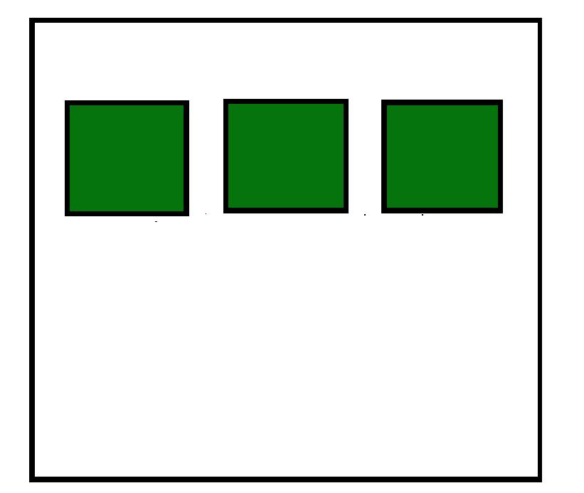
CSS Flexbox is a layout model that helps create flexible and responsive designs. Setting display: flex makes child elements flexible and easy to align and space.
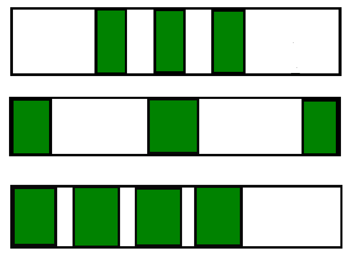
Enables efficient alignment, spacing, and distribution of items along a row or column.
Allows items to grow, shrink, or wrap based on available space.
Eliminates the need for floats or complex positioning for common layout patterns.
Note: Not all browsers support the flexbox properties, so make sure that the browser you are using supports this property.
Flexbox
Applying display: flex to a parent container makes its child elements flex items, allowing easy control over their alignment, spacing, growth, and shrinking behavior.
Display: flex: Applies flexbox to the parent container, making child elements flex items.
Flex Items: Flexible elements that can grow, shrink, and adjust spacing.
