 |
VOOZH | about |
|
VOOZH | about |
These properties define the size of an element, controlling the space it occupies on a webpage for consistent layout and design. They can use units like pixels, percentages, or viewport values for responsive designs.
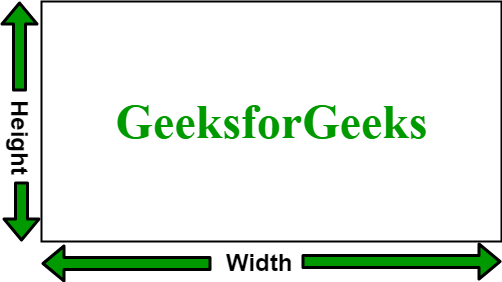
The width and height properties in CSS are used to define the dimensions of an element. The values can be set in various units, such as pixels (px), centimeters (cm), percentages (%), etc.
To set the height and width of an image, the width and height properties are used. These values can be specified in pixels, percentages, or other units.
These properties control the maximum and minimum width an element can have.
The max-width property is used to set the maximum width of a box. Its effect can be seen by resizing the browser window.
The min-width property is used to set the minimum width of a box. Its effect can be seen by resizing the browser window.
These properties define the maximum and minimum height an element can take.
The max-height property is used to set the maximum height of a box. Its effect can be seen by resizing the browser window.
The min-height property is used to set the minimum height of a box. Its effect can be seen by resizing the browser window.