In this article, we will learn how container-responsive suffixes work.
Blaze UI is a free, open-source UI toolkit to build a great website. It provides you with various features like responsiveness, custom components, etc. There are various sizes of containers available in the Blaze UI framework that the users can use in their web applications to organize the paragraphs or articles, etc. The containers provide the media query screen width restrictions on our content.
Blaze UI Container Classes:
o-container: This class is used to create a container.
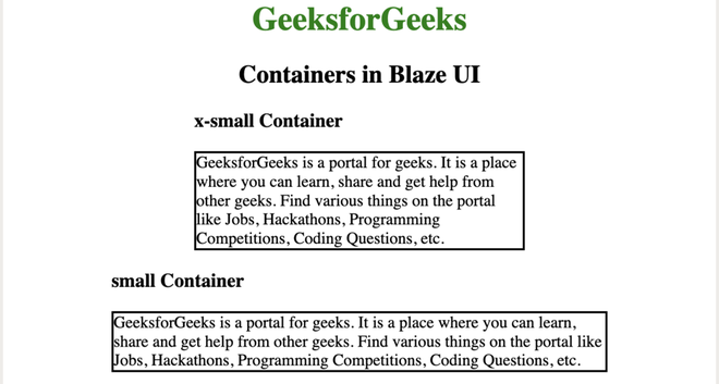
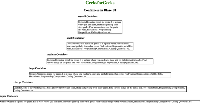
o-container–xsmall: This class is used to create an extra small container.
o-container–small: This class is used to create a small size container.
o-container–medium: This class is used to create a medium-size container.
o-container–large: This class is used to create a large size container.
o-container–xlarge: This class is used to create an extra-large size container.
o-container–super: This class is used to create a supersize container.
Variable Suffixes Used:
$screen-width-xsmall:20em: This variable is used for extra small-sized resolution.
$screen-width-small:30em: This variable is used for small-sized resolutions such as mobile phones.
$screen-width-medium: 48em: This variable is used for medium-sized resolutions such as tablet.
$screen-width-large: 64em: This variable is used for large-sized resolutions such as the small desktop.
$screen-width-xlarge: 78em: This variable is used for extra large-sized resolutions such as medium desktop.
$screen-width-super: 116em: This variable is used for super extra-sized resolutions such as the large desktop.
