 |
VOOZH | about |
|
VOOZH | about |
Tailwind CSS is a utility-first framework that allows fast development of designs with its large set of classes for utilities. Among its many utilities, Tailwind CSS border and spacing options are essential for designing attractive and well-organized layouts. This article explores the various approaches to using border and spacing utilities in Tailwind CSS.
Borders are used to define the edges of elements, adding visual structure and separation. Tailwind CSS provides various border utilities to manage border width, color, radius, and style. Spacing includes margins and paddings that determine the space around and inside elements. Tailwind CSS offers extensive spacing utilities to easily manage the layout and alignment of elements.
Tailwind CSS includes various classes to manage borders and margin and padding to manage spacing:
Table of Content
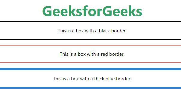
Tailwind CSS enables you to set border width and color using utility classes.
<element class="border-4 border-black">...</element>Example: This demonstrates the use of Tailwind CSS to style a title and three boxes with different border colors and thicknesses.
Output:
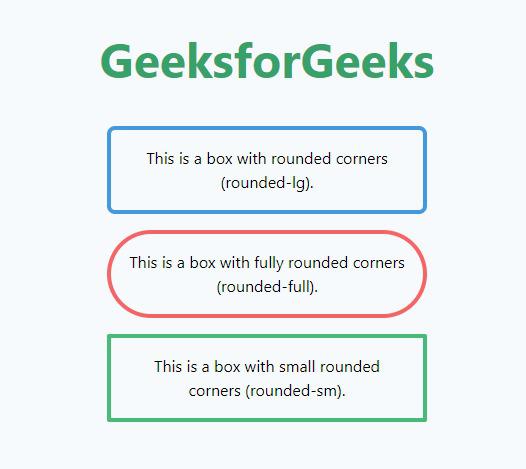
Tailwind CSS provides utilities to control the border radius, which defines the rounded corners of an element. Use classes like rounded,rounded-lg,rounded-full, etc., to apply different levels of border radius.
<element class="rounded-lg">...</element>Example: This demonstrates the use of Tailwind CSS to create a title and three bordered boxes with different corner radius styles: large, full, and small, all centered and responsive.
Output:
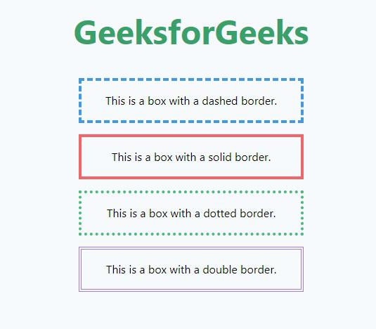
Tailwind CSS includes utilities to define the style of borders, such as solid, dashed, or dotted.
<element class="border-dashed">...</element>Example: This demonstrates the use of Tailwind CSS to create a title and four boxes, each with different border styles: dashed, solid, dotted, and double, all centered and responsive.
Output:
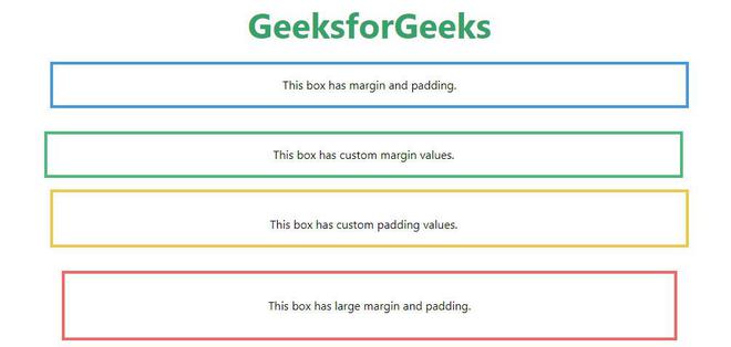
<element class="m-4 p-4">...</element>Example: The HTML code uses Tailwind CSS to create a centered layout with a title and four boxes, each demonstrating different combinations of margin and padding values.
Output:
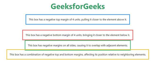
Tailwind CSS allows the use of negative margins to pull elements closer to their neighbors.
<element class="-m-2">...</element>Example: This example uses Tailwind CSS to display a title and four boxes with various negative margin settings, demonstrating how they affect the positioning of elements relative to their neighbors.
Output:
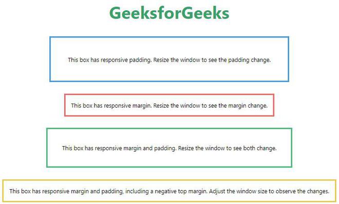
Tailwind CSS enables responsive design with spacing utilities that adapt to different screen sizes.
<element class="p-4 sm:p-6 md:p-8 lg:p-10 xl:p-12">...</element>Example: This example uses Tailwind CSS to create a title and four boxes demonstrating responsive padding and margin settings that adjust with screen size.
Output:
Following Tailwind CSS border and spacing utilities, you can easily create attractive and well-organized layouts. These tools help you design flexible and responsive interfaces quickly. Whether you're handling a small project or a large one, Tailwind CSS helps you achieve the style and structure you want.