VOOZH about

URL: https://www.geeksforgeeks.org/css/bulma-input-colors/

⇱ Bulma Input Colors - GeeksforGeeks


  • Courses
  • Tutorials
  • Interview Prep

Bulma Input Colors

Last Updated : 23 Jul, 2025

Bulma is an open-source CSS framework that can be used to make your web development faster as it comes with pre-built components and elements. In this article, we will be seeing how to change Bulma Input Colors using the color helper classes.

Input Color Classes:

  • is-primary: This class is used to set the input color to the primary color.
  • is-link: This class is used to set the input color to the link color.
  • is-info: This class is used to set the input color to the info color.
  • is-success: This class is used to set the input color to the success color.
  • is-warning: This class is used to set the input color to the warning color.
  • is-danger: This class is used to set the input color to the danger color.

Syntax:

<input class="input is-link" type="text" 
 placeholder="Input with Link Color">

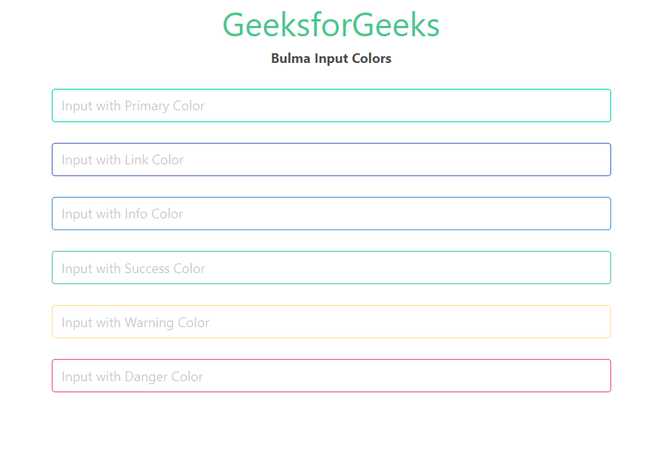
Example: The below example shows how to use the given classes to change the color of the input.

Output:

👁 Bulma Input Colors
Bulma Input Colors

Reference: https://bulma.io/documentation/form/input/#colors

Comment
Article Tags: