 |
VOOZH | about |
|
VOOZH | about |
Bulma uses Sass mixins to create the CSS output and they are mainly used within the context of the Bulma framework.
In this article, we will know about Bulma Responsive Mixins. Bulma Responsive Mixins are the mixins that help the users to define different styles for each screen size. Bulma has various different types of Responsive mixins as given below:
from() and until() mixins: Bulma uses these responsive mixins to target devices with a screen narrower than, wider than, or equal to the breakpoint.
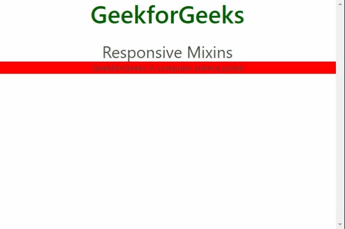
1. from(): The from() mixin is used to target devices with a screen wider than or equal to the breakpoint and has a single parameter that sets the screen width from which the styles it contains will be applied.
For using mixins, there is no specific predefined class given by Bulma rather we create our own classes and style them using SASS mixins.
Syntax:
.bulma - [CSS Mixin Name] - mixin{
 @include[CSS Mixin Name]($breakpoint);
}
Parameters: Following are the parameters that are accepted by the above mixin.
Note: You must know the implementation of SASS mixins for the below examples. Please see the pre-requisite given on the link and then implement the below code.
Example: Below example illustrates the Bulma Responsive from() mixin.
SCSS file:
CSS code:
Output:
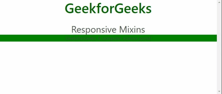
2. until(): The until() mixin is used to target devices with a screen narrower than the breakpoint and has a single parameter that sets the screen width until which the styles it contains will be applied. There is a 1px offset.
For using mixins, there is no specific predefined class given by Bulma rather we create our own classes and style them using SASS mixins.
Syntax:
.bulma-[CSS Mixin Name]-mixin{
 @include [CSS Mixin Name]($breakpoint);
}
Parameters: Following are the parameters that are accepted by the above mixin:
Note: You must know the implementation of SASS mixins for the below examples. Please see the pre-requisite given on the link and then implement the below code.
Example: Below example illustrates the Bulma Responsive until() mixin.
SCSS file:
CSS code:
Output:
Named Mixins: The Responsive mixin provides 11 named mixins. These mixins are dependent on 4 breakpoints and support 5 screen sizes and are named after these screen sizes and breakpoints. The following are the named mixins:
For using mixins, there is no specific predefined class given by Bulma rather we create our own classes and style them using SASS mixins.
Syntax:
.bulma-[CSS Mixin Name]-mixin{
 @include [CSS Mixin Name];
}
Parameters: Above mixins do not accept any parameters.
Note: You must know the implementation of SASS mixins for the below examples. Please see the pre-requisite given on the link and then implement the below code.
Example: Below example illustrates the Bulma Responsive Named mixins.
SCSS file:
CSS code:
Output: