 |
VOOZH | about |
|
VOOZH | about |
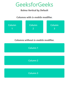
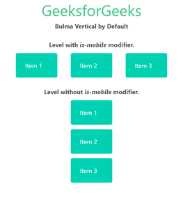
Bulma is a component-rich, mobile-first CSS framework based on flexbox. Since it is a mobile-first framework, by default the columns are stacked vertically on top of each other, the children of the level component are also shown vertically on mobile devices and the navigation menu is also hidden on mobile devices by default.
So, if we want, we can force layout columns and the level component horizontally by using the is-mobile modifier.
Bulma Responsiveness Vertical by default Classes:
Syntax:
<div class="columns is-mobile">
 ...
</div>
Example 1: The below example shows the use of the is-mobile modifier on the columns to make them adopt a horizontal layout on mobile devices.
Output: (On mobile devices)
Example 2: The below example shows the use of the is-mobile modifier on the levels component in Bulma.
Output: (on mobile devices)