 |
VOOZH | about |
|
VOOZH | about |
The CSS clamp() function sets a responsive value that stays between a specified minimum and maximum limit. It is commonly used for flexible sizing in layouts and typography.
Syntax :
clamp(value1, value2, value3)Parameters:
Here are some examples discussed:
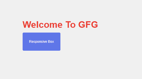
Example 1: The clamp() function creates a responsive heading and box size by keeping their values between specified minimum and maximum limits.
Output:
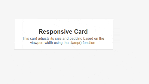
Example 2: The clamp() function creates a responsive card whose width, padding, and text size automatically adjust within defined minimum and maximum limits.
Output: