 |
VOOZH | about |
|
VOOZH | about |
The flex-shrink property in CSS defines how a flex item will shrink relative to the other flexible items within the same container. This is important for responsive design, as it allows elements to adjust their size dynamically based on the available space.
Note: If the item in the container is not flexible then the flex-shrink property will not affect that item.
flex-shrink: <number> | initial | inherit;Default Value: 1
Property Value | Description |
|---|---|
number | A number that defines how the item will shrink compared to other flexible items. |
initial | It sets the value to its default value. |
inherit | It inherits the property from its parent elements. |
Here are some basic examples of how the CSS flex-shrink property works:
In this example, we show how the flex-shrink property works in a flex container. The second div has a higher shrink value (flex-shrink: 4), so it shrinks more than the others when space is limited, helping control how much each item shrinks.
Output:
👁 Basic Usage of flex-shrink output
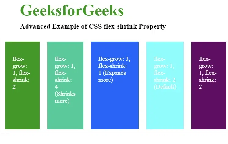
In this example, we show how the flex-shrink and flex-grow properties work in a flex container to create a responsive layout. Items shrink when space is limited and expand when extra space is available.
Output :
The browser supported by CSS flex-shrink Property are listed below: