 |
VOOZH | about |
|
VOOZH | about |
CSS units are used to define the sizes of elements in web design. Different units offer varying levels of flexibility and control over the layout and appearance of web pages. Commonly used units such as percentages (%), em, rem, pixels (px), viewport height (vh), and viewport width (vw). CSS units fall into two main categories:
Absolute units have a fixed size that does not change based on the context of the parent or viewport. They are a fixed measure and stay consistent no matter where they're used on the page.
10px means 10 fixed pixels.Usage Example (Absolute Unit):
Here, the width and height will always be 200 pixels and 100 pixels, no matter where the div is placed.
Definition:
Relative units are flexible and adapt based on other values, such as the parent element, the font size, or the viewport size. They provide more flexibility and are essential for building responsive designs.
50%, it will take up half of its parent element’s width.16px, then 1em equals 16px. So, 2em would be 32px.em, but instead of the parent’s font size, rem is relative to the root element (<html>). Typically, 1rem is set to 16px by default in most browsers.50vw, it will take up half of the viewport’s width, no matter what device or screen size is being used.100vh would be the full height of the browser window.Usage Example (Relative Unit):
width: 50% means the div will be 50% of its parent element's width.font-size: 2em means the font size will be twice the size of its parent element’s font size.The percentage unit is used to set values relative to the current font-size or the size of the parent element. This unit is highly flexible and allows for responsive design adjustments.
Example: Setting the font-size relative to the current font-size.
font-size: 150%;
The em unit is relative to the font-size of the element it is used on. For example, 2em means two times the size of the current font.
Example: Setting the font-size relative to the current font-size.
font-size: 2em;
Note: Here,
2emmeans 2 times the size of the current font.
The rem unit is relative to the root element (usually the <html> element) font-size, making it consistent across the entire document.
Example: Setting the font-size relative to the browser base font-size.
font-size: 1.5rem
The pixel unit is an absolute unit used to define sizes in terms of pixels. It ensures consistent size across different screens.
Example: Setting the font-size in pixels.
font-size: 16px;
The vh unit is relative to 1% of the viewport's height, making it useful for setting sizes based on the height of the browser window.
Example: Setting the height relative to the viewport height.
height: 50vh;
The vw unit is relative to 1% of the viewport's width, making it useful for setting sizes based on the width of the browser window.
Example: Setting the width relative to the viewport width.
width: 50vw;
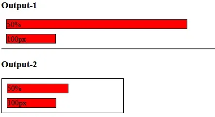
The pixel unit is an absolute unit to set the width i.e. it is always the same. A percentage unit is based on a relative unit i.e. it is based on its parent size.
Output :
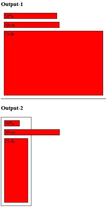
Another type of relative width is called view width (vw) and view height (vh). 1vw equals one percent of the entire screen size so 100 vw would take up the entire width and 50vw obviously would take up half the width but the important thing about vw versus percentages is that viewport units are based on the entire screen size while percentages are relative to their parent.
Output:
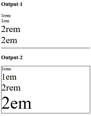
Both REM units and EM units are relative but instead of being relative to things around them such as the width of their parents or the height of the parents they're actually relative to the font size.
Output: