 |
VOOZH | about |
|
VOOZH | about |
Foundation CSS is an open-source and responsive front-end framework created by ZURB in September 2011 that makes it simple to create stunning responsive websites, apps, and emails that operate on any device. Many companies, like Facebook, eBay, Mozilla, Adobe, and even Disney, use it. The framework is based on bootstrap, which is similar to SaaS. The framework is built on Saas-like bootstrap. It is more sophisticated, flexible, and easily customizable. It also comes with CLI, so it’s easy to use it with module bundlers. It offers the Fastclick.js tool for faster rendering on mobile devices.
Abide in Foundation CSS is a form validation library that is used to validate the form with custom validators. Foundation CSS Abide Initial State is used to specify that an input field in a form is in the initial/starting state. It is useful to create forms with different custom validator attributes.
Variable Used:
| Variable-Name | Description | Type | Default-Value |
|---|---|---|---|
| $abide-inputs | This variable is used to define if error styles should be added to inputs. | Boolean | true |
| $abide-labels | This variable is used to define if error styles should be added to labels. | Boolean | true |
| $input-background-invalid | This variable is used to define the background color to use for invalid text inputs. | Color | get-color(alert) |
| $form-label-color-invalid | This variable is used to define color to use for labels of invalid inputs. | Color | get-color(alert) |
| $input-error-color | This variable is used to define the Default font color for the form error text. | Color | get-color(alert) |
| $input-error-font-size | This variable is used to define the default font size for the form error text. | Number | rem-calc(12) |
| $input-error-font-weight | This variable is used to define the default font weight for the form error text. | Keyword | $global-weight-bold |
Example 1: In the below code, we will make use of the above variable to demonstrate the use of the abide.
SASS Code:
$input-background-invalid:red;
label {
 background-color:$input-background-invalid ;
}
Compiled CSS Code:
label {
 background-color: red;
}
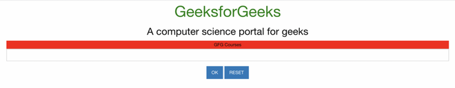
Output:
Example 2: In the below code, we will make use of the above variable to demonstrate the use of the abide.
SASS Code:
$input-error-color:#BD5A00;
label {
 color:$input-error-color ;
}
Compiled CSS Code:
label {
 color: #bd5a00;
}
Output:
Reference: https://get.foundation/sites/docs/abide.html