 |
VOOZH | about |
|
VOOZH | about |
Foundation CSS is an open-source & responsive front-end framework built by ZURB foundation in September 2011, that makes it easy to layout stunning responsive websites, apps, and emails that appear amazing and can be accessible to any device. In this article, we discuss flex grid offsets.
flex grid offsets: Offset work is similar to the float grid. flex grid offset is used to set the margin on left for a column and column alignment in right.
Flex Grid offset class:
Example 1: This example illustrates the use of grid offset using the large-offset-2 class.
Output:
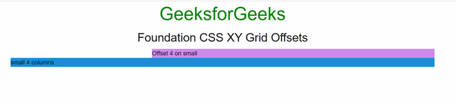
Example 2: This example illustrates the use of grid offset using the small-offset-4 class.
Output: