 |
VOOZH | about |
|
VOOZH | about |
Foundation CSS is an open-source and responsive front-end framework created by ZURB in September 2011 that makes it simple to create stunning responsive websites, apps, and emails that operate on any device. Many companies, like Facebook, eBay, Mozilla, Adobe, and even Disney, use it. The framework is based on Bootstrap, which is similar to SaaS. It’s more complex, versatile, and configurable. It also comes with a command-line interface, making it simple to use with module bundlers. Email framework provides you with responsive HTML emails, which can be read on any device. Foundation for Apps allows you to build fully responsive web applications.
Foundation CSS Orbit is used to create the slider that swipes the elements using the orbit class. We can put any type of content inside the slides.
Variable Used:
| Variable-Name | Description | Type | Default-Value |
|---|---|---|---|
| $orbit-bullet-background | This variable is used to define the default color for Orbit's bullets. | Color | $medium-gray |
| $orbit-bullet-background-active | This variable is used to define the default active color for Orbit's bullets. | Color | $dark-gray |
| $orbit-bullet-diameter | This variable is used to define the default diameter for Orbit's bullets. | Number | 1.2rem |
| $orbit-bullet-margin | This variable is used to define the default margin between Orbit's bullets. | Number | 0.1rem |
| $orbit-bullet-margin-top | This variable is used to define the default distance from the slide region for Orbit's bullets. | Number | 0.8rem |
| $orbit-bullet-margin-bottom | This variable is used to define the default bottom margin from Orbit's bullets to whatever content may lurk below it. | Number | 0.8rem |
| $orbit-caption-background | This variable is used to define the default background color for Orbit's caption. | Color | rgba($black, 0.5) |
| $orbit-caption-padding | This variable is used to define the default padding for Orbit's caption. | Number | 1rem |
| $orbit-control-background-hover | This variable is used to define the default background color for Orbit's controls when hovered. | Color | rgba($black, 0.5) |
| $orbit-control-padding | This variable is used to define the default padding for Orbit's controls. | Number | 1rem |
| $orbit-control-zindex | This variable is used to define the default z-index for Orbit's controls. | Number | 10 |
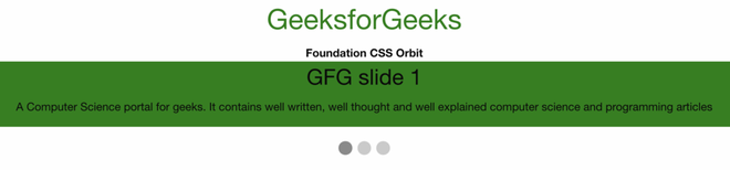
Example 1: In the below code, we will make use of the above variable to demonstrate the use of orbit.
SASS Code:
$orbit-caption-background: green;
.is-active {
 background-color:$orbit-caption-background;
}
Compiled CSS Code:
.is-active {
 background-color: green;
}
Output:
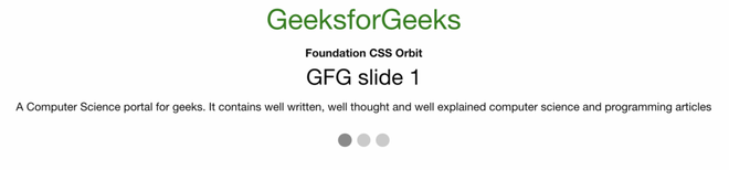
Example 2: In the below code, we will make use of the above variable to demonstrate the use of orbit.
SASS Code:
$orbit-bullet-margin: 0.1rem;
.orbit-bullets{
 margin:$orbit-bullet-margin;
}
Compiled CSS Code:
.orbit-bullets {
 margin: 0.1rem;
 }
Output:
Reference: https://get.foundation/sites/docs/orbit.html