 |
VOOZH | about |
|
VOOZH | about |
Foundation CSS is a front-end framework used for responsive websites, apps, and emails for any device. It also has many front-end templates like Bootstrap, Semantic UI, and other Front-end frameworks. It is flexible, readable and it is completely customizable. Top tech giants like Adobe, Amazon, Cisco, Hp, Mozilla, Samsung, etc. are using Foundation CSS. In this article, we are going to build a simple webpage with Responsive Accordion Tabs in Foundation CSS.
Responsive Accordion Tabs: These are one of the Foundation CSS Containers that are used to switch between two components at different breakpoints responsively. The content of a heading or a topic will be hidden until the particular topic was clicked. The content will be displayed as a drop-down box and other topic content will be automatically hidden. It will switch between tabs to list and vice versa from device to device responsively.
Variable Used:
| Variable Name | Description | Type | Default-Value |
|---|---|---|---|
| $accordion-background | This variable defines the default text color for items in a Menu. | Color | $white |
| $accordion-plusminus | This variable is used to define the plus and minus icons on the side of each accordion title. | Boolean | true |
| $accordion-plus-content | This variable is used to define the content for the plus icon when $accordion-plusminus is true. | String | '\002B' |
| $accordion-minus-content | This variable is used to define the content for the minus icon when $accordion-plusminus is true | String | '\2013' |
| $accordion-title-font-size | This variable is used to define the font size of accordion titles. | Number | rem-calc(12) |
| $accordion-item-color | This variable defines the default text color for items in a Menu. | Color | $primary-color |
| $accordion-item-background-hover | This variable defines the default background color on hover for items in a Menu. | Color | $light-gray |
| $accordion-item-padding | This variable is used to define the default padding of an accordion item. | Number or List | 1.25rem 1rem |
| $accordion-content-background | This variable is used to define the default background color of tab content. | Color | $white |
| $accordion-content-border | This variable is used to define the default border color of tab content. | Color | 1px solid $light-gray |
| $accordion-content-color | This variable is used to define the default text color of tab content. | Color | $body-font-color |
| $accordion-content-padding | This variable is used to define the default padding for tab content. | Number or List | 1rem |
| $tab-margin | This variable is used to define the default margin of the tab bar. | Number | 0 |
| $tab-background | This variable is used to define the default background color of a tab bar. | Color | $white |
| $tab-color | This variable is used to define the font color of the tab item. | Color | $primary-color |
| $tab-background-active | This variable is used to define the Active background color of a tab bar. | Color | $light-gray |
| $tab-active-color | This variable is used to define the active font color of the tab item. | Color | $primary-color |
| $tab-item-font-size | This variable is used to define the font size of tab items. | Number | rem-calc(12) |
| $tab-item-background-hover | This variable defines the default background color on hover for items in a Menu. | $white | |
| $tab-item-padding | This variable is used to define the default padding of a tab item. | Number | 1.25rem 1.5rem |
| $tab-content-background | This variable is used to define the default background color of tab content. | Color | $white |
| $tab-content-border | This variable is used to define the default border color of tab content. | Color | $light-gray |
| $tab-content-color | This variable is used to define the default text color of tab content. | Color | $body-font-color |
| $tab-content-padding | This variable is used to define the default padding for tab content. | Number or List | 1rem |
Example 1: In the below code, we will make use of the above variable to demonstrate the use of the Responsive Accordion Tabs.
SASS Code:
$accordion-background: white;
.accordion {
 background-color:$accordion-background;
}
Compiled CSS Code:
.accordion {
 background-color: white;
}
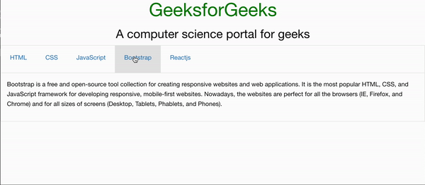
Output:
Example 2: In the below code, we will make use of the above variable to demonstrate the use of the Responsive Accordion Tabs.
SASS Code:
$accordion-content-border: 1px solid lightgrey;
.accordion {
 border:$accordion-content-border;
}
Compiled CSS Code:
.accordion {
 border: 1px solid lightgrey;
}
Output:
Reference: https://get.foundation/sites/docs/responsive-accordion-tabs.html