 |
VOOZH | about |
|
VOOZH | about |
Details Element is an element in HTML to create a Dialog box with some summary that can open or close. In this article, you will understand to animate the details element using CSS.
Syntax:
<details [open]>
 <summary> ... </summary>
</details>
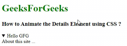
Example 1: In this example, we will look at how the details element works without any styling.
Output:
Amination on Details Element: Now we need to animate it to close/open. HTML provides its own default feature to this element by which it can close or open the content, but it's not much responsive and hence we can use CSS to make it look attractive.
It consists of an arrow to open and close which we can animate using CSS. On the click of the arrow, the details element expands. Below is the approach to animate the arrow of the details element.
Approach 1: Now, we will animate the details element with CSS. You can animate the arrow at the summary area as follows:
details[open] > element_to_be_animated { ... }
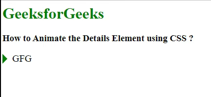
Example: In this example, we are making an arrow to rotate by 90o below using the above approach. Using summary I am selecting the details summary element and using ::before I am designing the arrow
By making the summary display as a block I am removing the default arrow from the details element
Output:
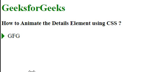
Approach 2: In this approach, we will add a hover effect on the details content
Example: In this example, we are making the details element more responsive. Here the content's font size also increases responsively when it opens and gets hovered.
Output: