 |
VOOZH | about |
|
VOOZH | about |
In CSS, the box-shadow property allows you to add a shadow effect to an element. However, when it comes to applying box shadow to a combination of elements such as a <span> and <input>, it can be a bit tricky to get the desired effect.
In this article, we will discuss how to apply box-shadow to a <span> <input> combination so that it looks like one single element to the user. We will cover the syntax for the box-shadow property, and different approaches to applying it, and provide at least two examples with output images.
Syntax:
box-shadow: h-offset v-offset blur spread color;
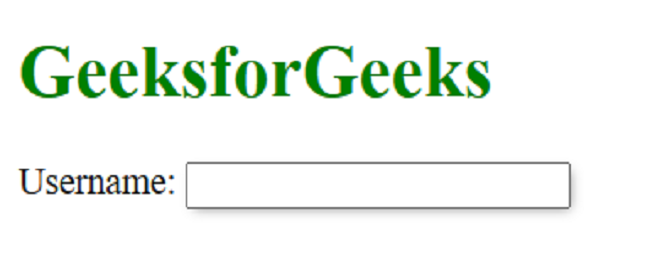
Approach 1: Using a wrapper div: One approach is to wrap the <span> and <input> elements inside an <div> element and apply the box-shadow property to the <div> element.
Example: In this example, we are using the above-explained approach.
Output:
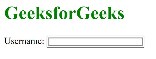
Approach 2: Using the: before pseudo-element: Another approach is to use the: before pseudo-element to create a shadow effect.
Example: In this example we are using above approach.
Output:
Approach 3: Using the outline property: Finally, you can use the outline property to create a shadow effect.
Example: In this example, we are using the above-explained approach.
Output: