 |
VOOZH | about |
|
VOOZH | about |
In HTML, arranging images and text is essential for creating visually appealing and readable web pages. We can position images in various ways to achieve the desired layout, including the inline with text, above, below, or beside it. Understanding how to align and arrange these elements helps to enhance the user experience. We are going to arrange the images and text in HTML.
Below are the following approaches to arrange Images and Text in HTML:
Table of Content
In an inline arrangement, images are placed directly within the flow of the text. The image can be treated like a character in the text, meaning it appears alongside the text, wherever the image tag (<img>) is located. This approach is best when you want to insert a small image inside the sentence or paragraph.
Example: In this example, the image is inserted in the middle of the text. The width and height attributes are used to control the image size.
Output: The image will appear inline with the text and the surrounding text will adjust accordingly.
In block arrangement, the image can be placed in its own block above or below the text. This approach is commonly used for placing the image as a header or footer for the section. The image and text are treated as the separate elements, stacked on the top of each other.
<div>
 <img src="image.jpg" alt="Image Description">
 <p>This is some text below the image.</p>
</div>
Example: In this example, the image appears above the text. we can adjust the image size using the width and height attributes.
Output: The image will be placed above the text and the both are treated as the separate block elements.
In this approach, the image can be placed to the left or right of the text, and the text wraps around the image. The layout is often used in the news articles or blogs where the image is placed beside the text. It can achieved using the CSS float property.
<style>
 img {
 float: left;
 /* or right */
 margin: 10px;
 }
</style>
<p>
 <img src="image.jpg" alt="Wrapped Image">
 This text wraps around the image when the image is floated to the left or right.
</p>
Example: In this example, the image is floated to the right side and the text wraps around it.
Output: The image will be floated to the right and the text will wrap around it.
Flexbox is the modern CSS layout model designed to the align and distribute items in the container, making it a great tool for responsive layouts. We can align the images and text side by side using Flexbox. It can provides the flexibility to adjust the layout for the different screen sizes.
<style>
 .container {
 display: flex;
 align-items: center;
 justify-content: space-between;
 }
</style>

<div class="container">
 <img src="image.jpg" alt="Image">
 <p>This is some text aligned next to the image using Flexbox.</p>
</div>
Example: In this example, the image and text are aligned horizontally, and you can control the spacing using the gap property.
Output: The image and text will be displayed side by side with the Flexbox's flexible alignment.
CSS Grid is a powerful tool that allows you to create the complex layouts by dividing the page into the rows and columns. With the CSS Grid, we can arrange the images and text in the different areas of the grid, giving you precise control over the positioning.
<style>
 .grid-container {
 display: grid;
 grid-template-columns: 1fr 1fr;
 gap: 10px;
 }
</style>

<div class="grid-container">
 <img src="image.jpg" alt="Image">
 <p>This text is arranged next to the image using Grid layout.</p>
</div>
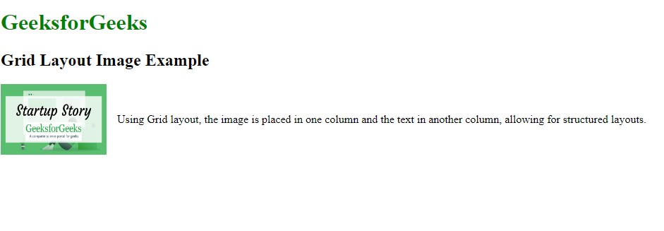
Example: In this example, the image can occupies the one column and the text occupies the another column in the grid.
Output: The image and text are displayed in the two column grid, with the image in the one column and the text in another.
These methods can provides the flexible options for arranging the images and text in a HTML page, each suited for the different types of the layouts. Flexbox and Grid are modern approaches, providing the more straightforward ways to position images and text.