 |
VOOZH | about |
|
VOOZH | about |
Checkboxes are commonly used on websites to enable users to make selections, such as agreeing to terms and conditions or choosing preferences. A checkbox is a small square box in forms that users can click to select or deselect an option. By default, the checkmark inside the checkbox has a basic style, which may not match your site's design.
Below are some common methods that can be used to change the checkbox mark color:
The easiest way to change the checkbox appearance is by removing the default style using the appearance property in CSS.
Now, let us understand with the help of the example:
Output
A common approach is to make a custom checkbox and its checked mark by hiding the normal checkbox and using the ::before and ::after pseudo-elements. This gives us complete control over how the checked and unchecked status look.
Now, let us understand with the help of the example:
Output
This property allows you to pick a single color that will be applied to the background of the checkbox, the checked mark, and other parts of the form control.
Now, let us understand with the help of the example:
Output
For a more unique and personalized checkbox design, a custom background image can be applied to the checked mark, allowing for greater flexibility and customization beyond the default styles.
Now, let us understand with the help of the example:
Output
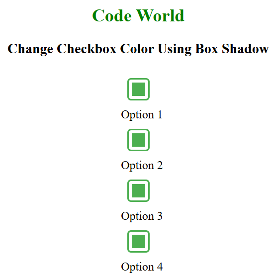
To change the color of the checked mark without fully redesigning the checkbox, the box-shadow property can be used to create a simple and subtle effect.
Now, let us understand with the help of the example:
Output
Checkboxes are crucial for user selections on websites, but their default appearance may not fit the site’s design. By using CSS techniques like appearance: none, pseudo-elements, the accent-color property, custom background images, and box-shadow, the checkbox and its checked mark can be easily customized to match the site's style and improve the user experience.