 |
VOOZH | about |
|
VOOZH | about |
Here are different ways to create a responsive grid layout with CSS.
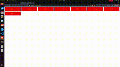
This method can be used CSS Grid for a responsive layout. The grid-template-columns property adjusts columns based on space, keeping a minimum width of 200 pixels. Gaps between items are set with grid-gap. This approach ensures a flexible design that adapts to different screen sizes, ideal for responsive web development.
Output
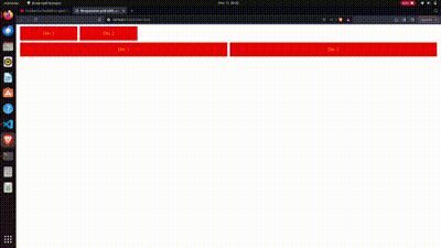
This approach provides flexibility in creating responsive grid layouts, allowing developers to choose between filling the space with fixed-width columns (auto-fill) or adjusting column widths to fit the container (auto-fit). The .auto-fill and .auto-fit classes are used to control the behavior of the grid columns. The .auto-fill class creates as many columns as possible with a minimum width of 200 pixels, while .auto-fit ensures that the columns fit snugly within the container, expanding or contracting as needed.
Output
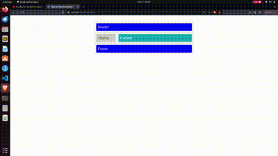
This method uses media queries to create a responsive webpage layout. The .wrapper class defines the grid container with areas for the header, sidebar, content, and footer. Layout changes based on screen width, ensuring a flexible design that adapts to different sizes while maintaining structure and styling for each area.
Output