VOOZH about

URL: https://www.geeksforgeeks.org/css/how-to-create-animated-loader-ring-using-html-and-css/

⇱ How to Create Animated Loader Ring using HTML and CSS? - GeeksforGeeks


  • Courses
  • Tutorials
  • Interview Prep

How to Create Animated Loader Ring using HTML and CSS?

Last Updated : 10 Oct, 2024

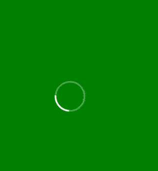
An Animated Loader Ring using HTML and CSS is a circular loading animation that visually indicates progress or loading status. It is created with a simple HTML structure and animated using CSS properties like border, transform, and @keyframes for rotation effects.

Approach

  • HTML Structure: The code uses a <div> with the class .circle to create the loader ring.
  • Body Styling: Sets the background color to green and removes default margins and padding for full coverage.
  • Loader Design: The .circle class styles the ring with size, position, border, and circular shape.
  • Animation Setup: Uses @keyframes to animate the loader, rotating it from 0 to 360 degrees.
  • Infinite Spin: The animation runs infinitely with a 1-second duration and linear timing for smooth rotation.

Example: Here we create an animated loader ring using a <div> styled as a circle. It continuously spins with a 1-second infinite rotation animation, simulating a loading effect on a green background.

Output:

👁 z1
Comment
Article Tags:
Article Tags: