 |
VOOZH | about |
|
VOOZH | about |
Testimonials are a powerful way to build trust and credibility for your brand. They showcase the positive feedback and experiences of your clients or users. To ensure your testimonials look great on all devices, it’s essential to make them responsive. Here, we’ll explore different approaches to creating responsive testimonials with CSS.
These are the following approaches to create responsive testimonials with CSS:
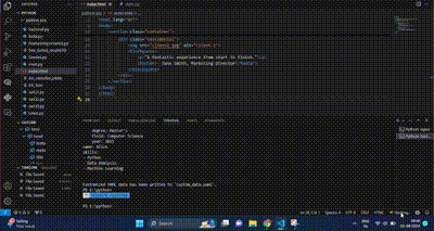
Flexbox is designed for one-dimensional layouts. It aligns items along a single axis (either row or column) and is excellent for distributing space and aligning items dynamically. That's why we are using this to create the responsive Testimonials.
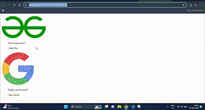
Example: This example shows the use of flexbox to create the responsive testimonials.
Output:
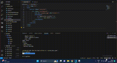
CSS Grid Layout is designed for two-dimensional layouts, meaning it can handle both rows and columns simultaneously. It's ideal for more complex designs. That's why we are using this to create the responsive Testimonials.
Example: This example shows the use of grid o create the responsive testimonials.
Output:
Media queries apply different styles based on the screen size or device characteristics. They are used to make design adjustments to suit various devices. That's why we are using this to create the responsive Testimonials. as it will allow us to resize the template.
Example: This example shows the use of media queries to create the responsive testimonials.
Output:
Creating responsive testimonials ensures that your feedback section looks great on all devices, enhancing user experience and credibility. By using Flexbox, Grid Layout, or Media Queries, you can achieve a responsive design that adapts to different screen sizes.