 |
VOOZH | about |
|
VOOZH | about |
Tailwind CSS classes are used to style elements and apply animations effortlessly. Utilize Tailwind's animation utility classes to add dynamic visual effects. Combine Tailwind CSS with custom CSS animations for versatile and engaging web designs.
Table of Content
In this approach, the 'animate-bounce', 'animate-spin', 'animate-pulse', and 'animate-ping' classes trigger corresponding animations, such as bouncing, spinning, pulsing, and pinging, respectively. Each animated element is styled with background color and text color classes for visual appeal.
Example: The example below uses pre-built utility classes from Tailwind CSS to easily apply animations to elements.
Output:
👁 73946383-4121-4bf6-8442-b4da86bb25db
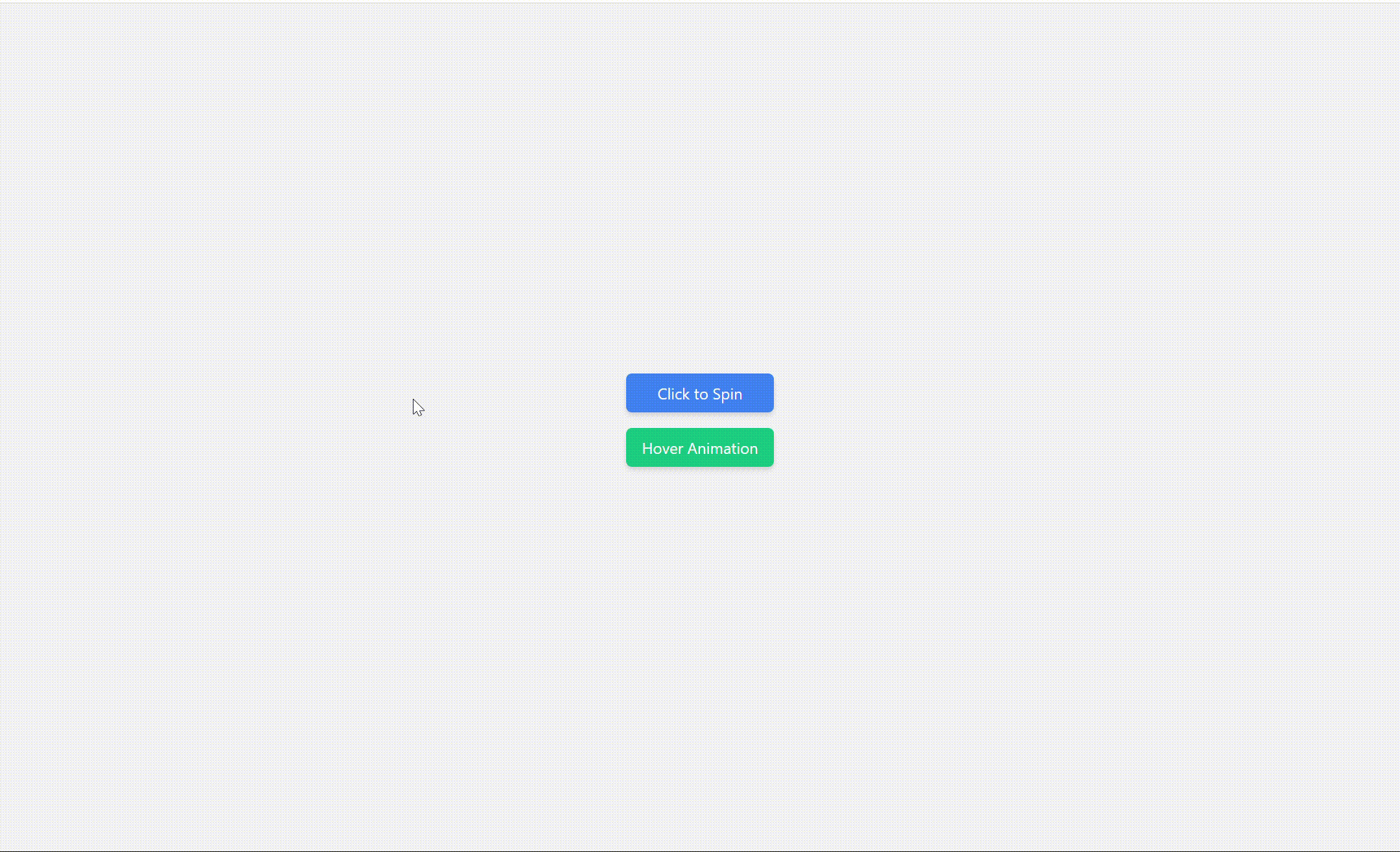
In this approach, the 'clickMe' element, styled with Tailwind CSS classes, toggles a spinning animation when clicked. This animation is defined using the @keyframes rule in the embedded CSS, rotating the element 360 degrees. Additionally, hovering over the second element triggers a bouncing animation.
Example: The example below shows CSS Animations with Tailwind CSS and JavaScript.
Output:
👁 61a81752-1878-4870-875f-2b0b21f31e0e
In this approach, The elements utilize Tailwind CSS classes for styling, and the animations are applied using the defined internal CSS animations. We've added two new animations: slide-in-bottom and spin-scale. Each animation is defined using internal CSS. The first element slides in from the bottom with fading opacity, defined by the slideInBottom keyframes animation. The second element combines scaling and spinning effects
Example: The example below shows CSS Animations with Tailwind CSS.
Output: