 |
VOOZH | about |
|
VOOZH | about |
Onsen UI CSS is used to create beautiful HTML components. It is one of the most efficient ways to create HTML5 hybrid components that are compatible with both mobile and desktop.
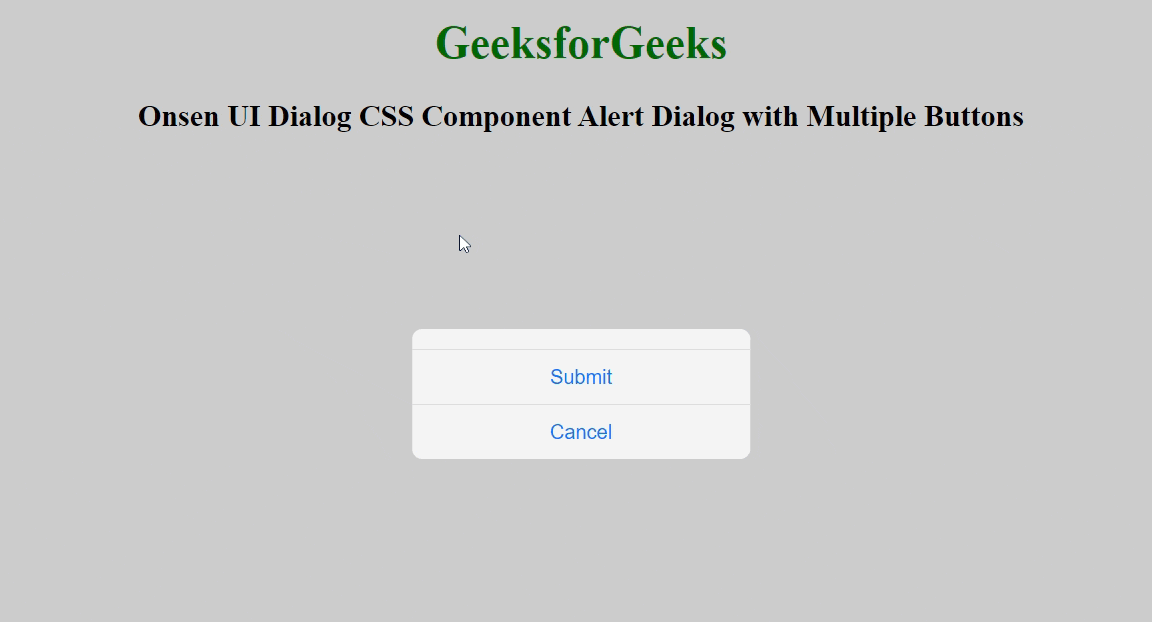
Alert Dialog is used to display some warning messages with pop-ups on the webpage. Onsen UI Dialog CSS Component Alert Dialog with Multiple Buttons is used to create the alert dialog box with multiple buttons using the below class.
Onsen UI Dialog CSS Component Alert Dialog with Multiple Buttons Class:
Syntax:
<div class="alert-dialog-mask"></div>
<div class="alert-dialog">
 <div class="alert-dialog-footer">
 <button class="alert-dialog-button">
 ...
 </button>
 </div>
</div>
</div>
Example 1: The following example demonstrates the Onsen UI Dialog CSS Component Alert Dialog with Multiple Buttons.
Output:
Example 2: The following example demonstrates the Onsen UI Dialog CSS Component Alert Dialog with Multiple Buttons.
Output: