 |
VOOZH | about |
|
VOOZH | about |
Primer CSS is a free open-source CSS framework that is built upon systems that create the foundation of the basic style elements such as spacing, typography, and color. This systematic method makes sure our patterns are steady and interoperable with every other. Its approach to CSS is influenced by object-oriented CSS principles, functional CSS, and BEM architecture. It is highly reusable and flexible.
Buttons help us to initiate an action such as submitting a form, navigating to another link, etc. To create a button in Primer CSS, we use the .btn class on the <button> or <a> tag.
In this article, we will learn about all the different types of buttons that are available in the Primer CSS.
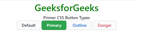
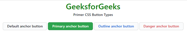
Primer CSS provides us with various types of buttons for different scenarios. The button types can be added to the <button> element using the predefined classes. There are 4 types of buttons in Primer CSS.
Button Types classes:
Syntax:
<button class="btn btn-primary">....</button>
Example 1: This demonstrates the different button types on the <button> element in Primer CSS.
Output:
Example 2: This demonstrates the different button types on the <a> element in Primer CSS.
Output:
Reference: https://primer.style/#button-types