 |
VOOZH | about |
|
VOOZH | about |
In this article, we will see the required reading. Primer CSS is a free open-source CSS framework based on principles that set the foundation for basic design elements like spacing, typeface, and color. This rigorous approach ensures that our patterns are consistent and interoperable.
Flexbox is a flexible box that is used to create a responsive website. In the required reading, we will discuss the flexbox types and various ways to create a flexbox.
Earlier, the flexbox was one-dimensional that can only deal with the layout in one dimension at a time either as a row or as a column but later in the latest version of CSS i.e CSS3 we can use a two-dimensional model which controls columns and rows together.
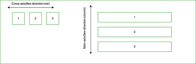
The two axes of flexbox: In a two-dimensional flexbox need to think in terms of two axes, the main axis, and the cross axis. The main axis is defined by the flex-direction property, and the cross axis runs perpendicular to it and it is referring back to these axes.
The main axis:
The cross axis: The cross axis is that axis which runs perpendicular to the main axis. So the above diagram will look like this.
Start and end line:
Earlier, when we write any document then the writing will start from left to right but in the latest CSS3 model there is a range of writing modes and that is the reason why we no longer assume that a line of text will start at the top left of a document and run towards the right-hand side, with new lines appearing one under the other.
English Writing Format:
Arabic Writing Format:
The flex container: It is used to make an element layout it's content using the flexbox model. Each direct child of the flex container will become a flex item.
Output:
Changing flex-direction: It is used to set the direction of the flex items in the flexbox.
Output:
Multi-line flex containers with flex-wrap: It is used to place flex items into a single line or wrapped onto multiple lines.
Output:
The flex-flow shorthand: This property is a sub-property of the flexible box layout module and also a shorthand property for flex-wrap and flex-direction.
Output:
Properties applied to flex items: We can use three properties to control flex items and the three properties are:
Output:
Alignment, justification, and division of interstitial space:
Output:
Reference: https://primer.style/product/css-utilities/#required-reading