Primer CSS is a free and open-source CSS framework. It is built upon the systems that create the foundation of the basic style elements such as spacing, typography, and color. Created with GitHub’s design system, it is highly reusable and flexible.
Primer CSS Forms provide different components for inputs such as text, checkbox, radio, selects, and textarea. In this article, we will learn about the different inputs that have different customization types.
Primer CSS Forms Types and Classes:
Kitchen Sink: Kitchen Sink Forms are used to create the form with all the inputs and buttons side by side for size testing and alignment of input elements.
btn: This class is used to create the default button.
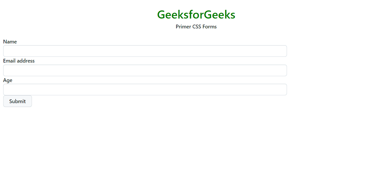
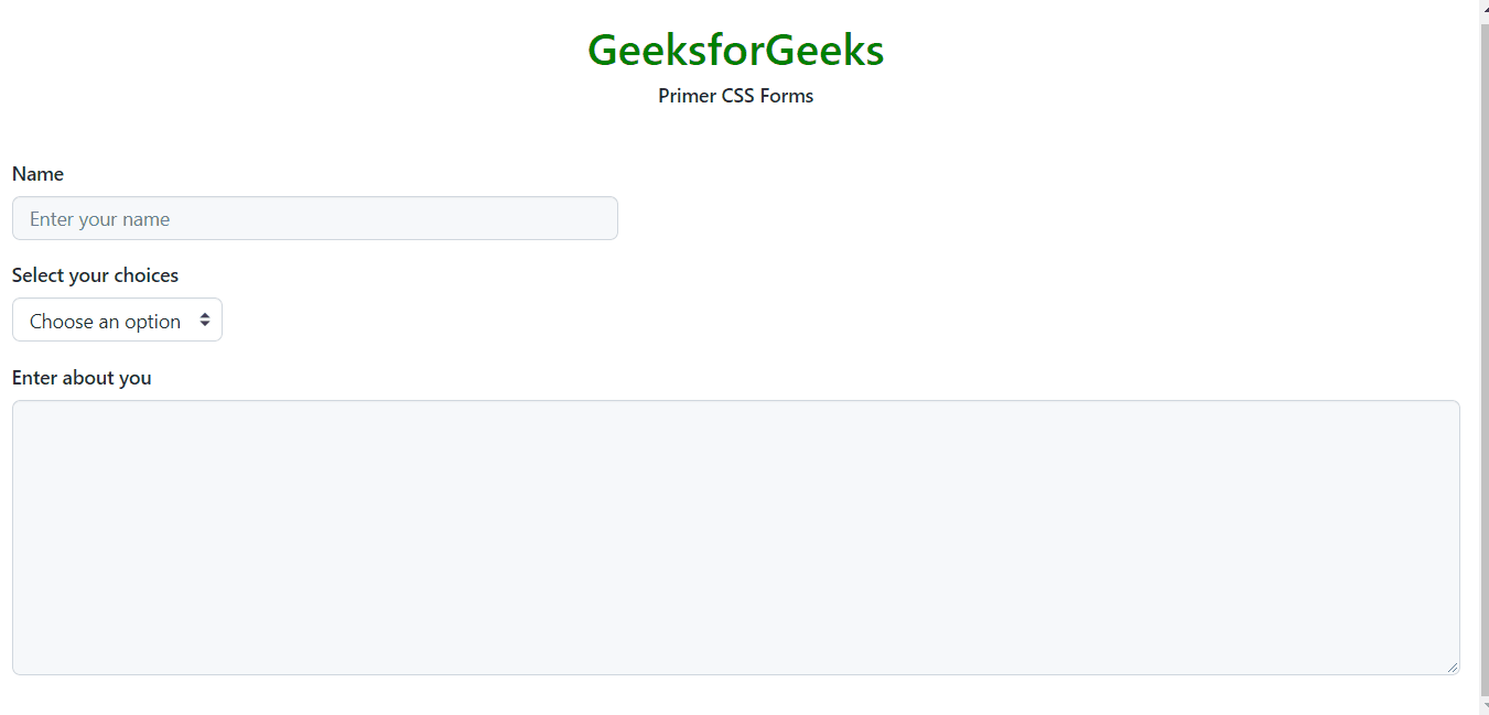
form-control: This class is used to create the form input field.
Inputs: The input element contains all the input types like text, radio, etc. The input has the following classes:
Sizing: We can customize the sizing using the following classes:
input-sm: It makes the size of the input small.
input-lg: It makes the size of the input large.
input-block: It makes the size of input of block type.
Input group: The inputs can be grouped by using the class input-group.
Customization: The different inputs can be customized as follows:
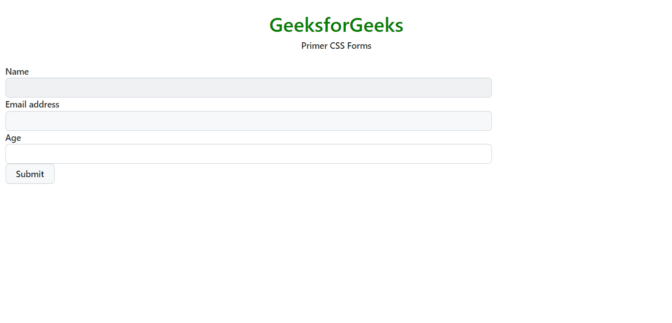
input-contrast: The input can have light background by using this class giving a contrast effect.
disabled: This option makes the input disabled with the form-control class.
input-hide-webkit-autofill: This class hides the icon and/or dropdown for auto-filling.
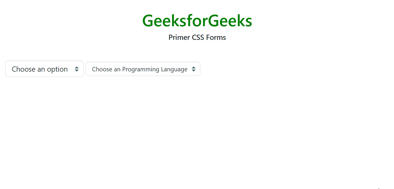
Select: This type of input is used to select different options from a dropdown. The following classes are used in it:
form-select: This class is used to create a select menu.
select-sm: This class makes the input of small size.
Form Groups: Form groups are used to group the different elements of the form and make them appear structured so that the form seems meaningful and adapts to different screen sizes. It has the following different classes.
form-group: This is used to create a form group.
form-group-header: It is used to create a header in the form group.
form-group-body: It contains the form group input elements.
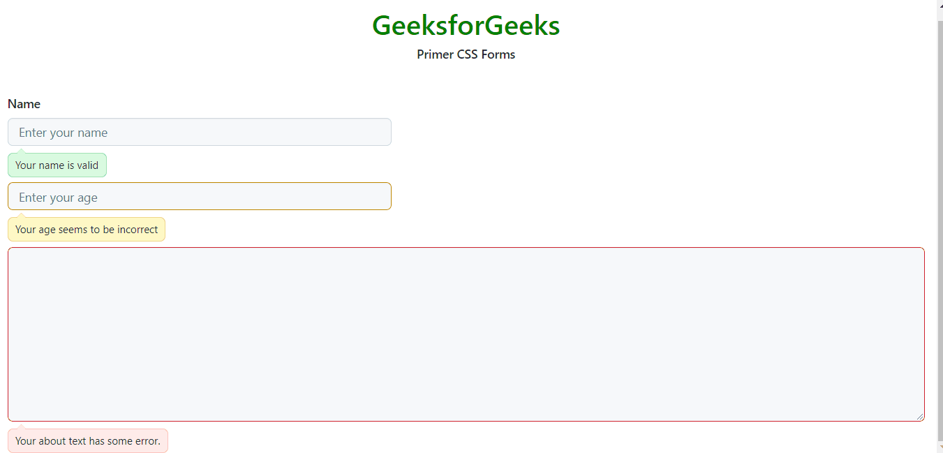
Form Group Validation: Validation is a necessary task so that the user inputs the data in the right format and order. The form group uses the following different classes:
Success: The class used is succeeded and is added if the input is valid. The class is added to the form group element.
Error: The class used is errored and is added if the input is not valid. The class is added to the form group element.
Warning: The class used is warn and is added to warn the user because of input. The class is added to the form group element.
form-actions: This class is used to wrap the elements that perform some actions such as the save button or link for some validation.
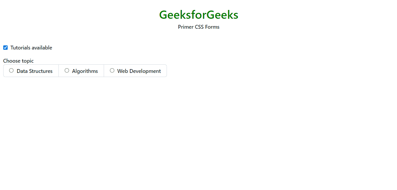
Checkboxes and radios: The checkboxes and radios are used to select some option value or set something to true/false. The different classes are as follows:
form-checkbox: This is used to create a container for the checkbox which contains the checkbox element and the label.
input-radio: This is used to create a radio input.
Radio group: The class used is radio-group to place radio inputs inside a group together.
Syntax: Create a form element with some input elements as follows.
Example 2: In the following example, we have different customization like disabled, input-contrast, and input-hide-webkit-autofill contact info suggestions on the different input elements.
