 |
VOOZH | about |
|
VOOZH | about |
Primer CSS is a free open-source CSS framework that is built with the GitHub design system to provide support to the broad spectrum of Github websites. It creates the foundation of the basic style elements such as spacing, typography, and color. This systematic method makes sure that our patterns are steady and interoperable with every other. Its approach to CSS is influenced by object-oriented CSS principles, functional CSS, and BEM architecture. It is a highly reusable model.
In this article, we will learn about the Primer CSS Layout position.
The Position utilities can be used to alter the document flow. The element's position depends on the content. The element's final position can be specified by utilizing top-0, right-0, bottom-0, and left-0. The Position can be classified & declared into 5 different categories i.e. relative, absolute, fixed, responsive position, position for screen-reader only, and sticky. The sticky position can further be classified as top, bottom, right & left.
Primer CSS Layout Position Classes:
In order to create the responsive position, we can use the below formula:
position-[breakpoint]-[property]
which will help to implement or change as per the breakpoint in the responsive layouts.
Note: Use combinations of the above classes for fixing your document layout positions as per your need. An example of syntax is given below.
Syntax:
<div class="top-0 left-0 position-absolute">
 ....
</div>
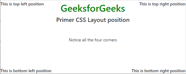
Example 1: The following example demonstrates the top and bottom positions in a default document layout that uses the position-absolute class.
Output:
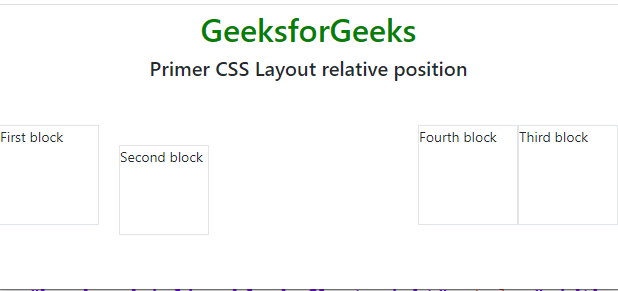
Example 2: The following code example demonstrates the use of the position-relative class to create a new stacking context.
Output:
Reference: https://primer.style/product/css-utilities/#position