 |
VOOZH | about |
|
VOOZH | about |
Primer CSS is a free open-source CSS framework that is built upon the GitHub design system to provide support to the broad spectrum of Github websites. It creates the foundation of the basic style elements such as spacing, typography, and color. This systematic method makes sure our patterns are steady and interoperable with every other. Its approach to CSS is influenced by Object-Oriented CSS principles, functional CSS, and BEM architecture. It is a highly reusable model.
One such component of Primer CSS is Progress Bar. In this article, we will learn about the Progress Bar component in Primer CSS. Progress Bar is a very useful component in displaying the progress of a user in completing a particular task like creating an account, reaching a particular goal, or downloading or uploading progress. It is used extensively in modern-day websites.
We can create Progress Bar using Primer CSS by adding the ".Progress" class to the element and adding the value of progress (in percentage) and the color of the progress bar inside the element with the class ".Progress-item".
The different components of Primer CSS Progress Bar are given below:
Syntax:
<span class="Progress">
 <span class="Progress-item color-bg-success"
 style="width=".."" >
 </span>
</span>
Note: Here we have used the ".color-bg-success" background color, you can use any other primer CSS background utilities color.
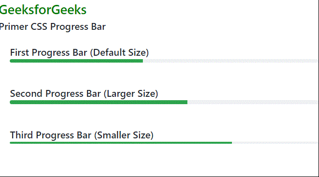
Example 1: We have created 3 progress bars. The first one is of the default size, the second one is larger, and the third one is smaller.
Output:
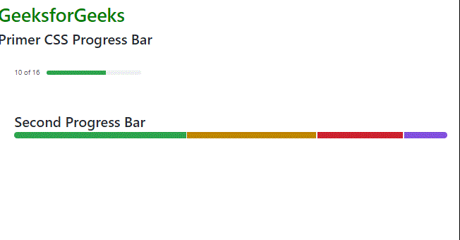
Example 2: Here we have created two Progress Bar. The first one is an inline Progress Bar, the second one is a multiple-line Progress Bar.
Output: