 |
VOOZH | about |
|
VOOZH | about |
Tailwind CSS offers various utility classes to set the mouse cursor appearance when pointing at an element. These classes correspond to the CSS cursor property, allowing you to quickly specify the cursor type without writing custom CSS
| Class | Description |
|---|---|
| cursor-auto | Default cursor set by the browser. |
| cursor-default | Default cursor appearance. |
| cursor-pointer | The cursor appears as a pointer, indicating a link. |
| cursor-wait | The cursor indicates that the program or process is busy. |
| cursor-text | Cursor indicates text that can be selected. |
| cursor-move | Cursor indicates that the element can be moved. |
| cursor-help | Cursor indicates that help is available. |
| cursor-not-allowed | Cursor indicates that the requested action will not be executed. |
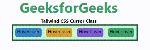
<element class="cursor-{behaviour}">...</element>Example: In this example we use Tailwind CSS via CDN, showcasing various cursor utility classes (cursor-auto, cursor-default, cursor-pointer, cursor-wait) with styled elements for hover interactions.
Output:
👁 ImageTailwind CSS simplifies cursor management with utility classes that mirror the CSS cursor property. These classes enhance user interactions by clearly indicating available actions, such as links, text selection, and restricted actions. Utilizing these classes, you can efficiently style cursor appearances without additional CSS, ensuring a responsive and intuitive user experience.