A dot plot (or dot chart) is a simple graph used to show numerical data. Each value is represented by a dot placed on a number line. If a value appears more than once, the dots are stacked above each other to show how many times it occurs.
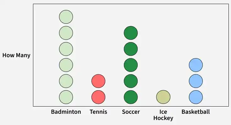
The record below shows a small data set of different sports preferred by people.
Dot plots are useful for small data sets and help students easily see the distribution, patterns, and outliers in the data.
Types of Dot Plot
There are primarily two types of dot plot mentioned below:
1. Wilkinson Dot Plot
The Wilkinson dot plot was developed by Leland Wilkinson to improve the basic dot plot. It is used to show how data is distributed, especially when there are many data points. In a simple dot plot, dots can overlap and look crowded. The Wilkinson dot plot solves this problem by arranging the dots neatly so they do not overlap. This makes the graph clearer and easier to understand.
2. Cleveland Dot Plot
The Cleveland dot plot, developed by William S. Cleveland, is a type of dot chart used to compare values across different categories. It is similar to a bar chart but uses dots instead of bars to represent values. The position of each dot shows the quantity, making the chart easy to read and compare. Cleveland dot plots are especially useful when working with multiple categories and help present data clearly in a small space.
To compare the categories more clearly, the Cleveland dot plot is illustrated below.
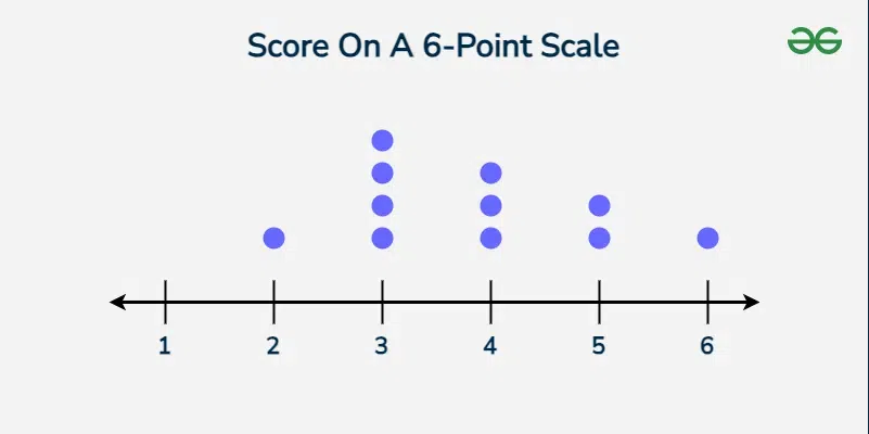
Example 1: The dot plot below is used to show how each student scored his or her in class essay in Mr. Jhonson’s class. Each group represents a different student. How do you know the lowest essay score achieved by a student and the highest number of essay score achieved by a student?
Here for easier imaging of the data dot plot feature was used which displays the data of the number of students who received scores for essays on a 6-point scale.
The lowest grade that was attained in a given essay is 2.
There are four students who got 3 and they are the majority leaving one with 2.
Thus, the lowest score in the marking of the minimum essay look is 2, and 3 – the highest number of marks earned by the students.
Example 2: Below is an example of a dot plot used to present the heights of the toddlers at Mrs. Bell’s daycare. Let us describe one dot, representing one toddler. What is the minimum height of a toddler?
The range on the axes is as follows: 80–86. Children aged 3 years and 3 months have lengths of 80 and 81. Two dashes at bin number 82 indicate that there are two toddlers with a height of 82 units. Thus, the maximum height measured for a toddler is 82 units.
Example 3: The frequency table below shows the number of hours that students spent on homework in one week; the table below shows the number of hours that students spent on homework in one week. Give a dot plot for the information provided.
