 |
VOOZH | about |
|
VOOZH | about |
In web development, styling is an important aspect of building visually appealing user interfaces. styled-components, a popular library that allows you to write CSS directly in the JavaScript code. In this article, we'll explore how to use styled-components for global styling in React applications.
styled-components is a library for React and React Native that helps to write CSS code within their JavaScript components. It uses tagged template literals to style components with the full power of JavaScript, including dynamic styles and props-based styling. styled-components promotes component-based styling, encapsulating styles within individual components for improved modularity and reusability.
GlobalStyle from styled-components to set global styles for body margin, color, and font-family.CustomButton styled-component for button styles including padding, margin, color, border, and background-color.GlobalStyle in the main component for global styles. Utilize CustomButton different props for styling variations.npx create-react-app globalstylescd globalStylesnpm install styled-components"dependencies": {
"@testing-library/jest-dom": "^5.17.0",
"@testing-library/react": "^13.4.0",
"@testing-library/user-event": "^13.5.0",
"react": "^18.3.1",
"react-dom": "^18.3.1",
"react-scripts": "5.0.1",
"styled-components": "^6.1.9",
"web-vitals": "^2.1.4"
}
Example: Below example shows implementation of global styling using styled-components module
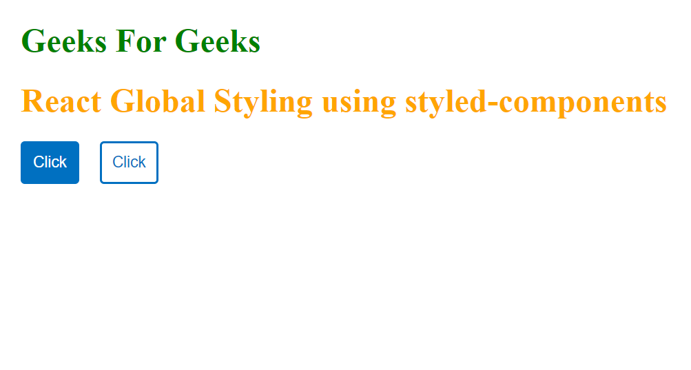
Start your application using the following command:
npm startOutput: Open your browser and go to https://localhost:3000/ you will see the following output