 |
VOOZH | about |
|
VOOZH | about |
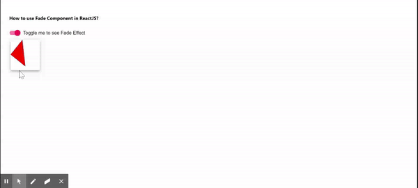
The Fade Component, available in Material UI for React, seamlessly adds a fade animation to a child element or component. Integrating this component into a React JS project is straightforward and enhances the user interface with ease.
Popper Transitions: The Transition component is used as an animated feature for the open/close state of the popper. This component should follow the following conditions.
Step 1: Create a React application using the following command.
npx create-react-app foldernameStep 2: After creating your project folder i.e. foldername, move to it using the following command.
cd foldernameStep 3: After creating the ReactJS application, Install the material-ui modules using the following command.
npm install @material-ui/coreProject Structure:
The updated dependencies in package.json file will look like:
"dependencies": {
 "@material-ui/core": "^4.12.4",
 "react": "^18.2.0",
 "react-dom": "^18.2.0",
 "react-scripts": "5.0.1",
 "web-vitals": "^2.1.4",
}
Example: Now write down the following code in the App.js file.
Step to Run Application: Run the application using the following command from the root directory of the project.
npm startOutput: Now open your browser and go to http://localhost:3000