 |
VOOZH | about |
|
VOOZH | about |
Lists are a continuous group of text or images. They are composed of items containing primary and supplemental actions, which are represented by icons and text. Material UI for React has this component available for us, and it is very easy to integrate. We can use the List Component in ReactJS using the following approach.
In this article, we will implement Material UI's List Component. We will create a list that will have some Geeks For Geeks Courses in it. We add more functionalities to that list like opening and closing a particular sublist.
Approach: First we will create a basic react app using some installations. We will make our new List Component reusing inbuilt list components with some styling using Material-UI. We are going to create a list that will have some Geeks For Geeks Courses in it. That list will be able to open and close by the List Header. Also, we will add a checkbox to show subitems of the list. On clicking the checkbox, the Sublist of GFG course details will also be shown accordingly. We will be using List, Collapse, and Checkbox components from Material UI. We will learn more about this while implementing it, now Let's start creating our List.
Step 1: Create a React application using the following command :
npx create-react-app foldername
Step 2: After creating your project folder i.e. folder name, move to it using the following command:
cd foldername
Step 3: After creating the React.js application, install the material-UI modules using the following command.
npm install @material-ui/core
npm install @mui/icons-material
npm install @mui/material
Project Structure: Now create a new file Header.js in the folder named "src". Our header component will reside in this file. Now the new project structure will look like this :
Changing the project structure: In your project directory, create a file named ListComponent.js in the src folder. Now your new project structure will look like this :
Step 4: Create the component ListComponent.js which we will use to display the List. We can expand the list by adding list items to it. To add icon after the list item's name we used the ListItemIcon component and to give a name to the list item we used ListItemText. For opening and closing the child list we used the Collapse component. IconButton is just icons but with the additional effects of buttons. ListItemText has two fields related to display text i.e primary and secondary. Primary displays the primary text i.e. in our example GFG course name. The secondary is the secondary content to display like additional information about the list item, here GFG course list details.
Step 5: After creating the ListComponent component, we will import it in App.js and make changes in App.js as follows.
Step to run the application: Run the application using the following command from the root directory of the project.
npm start
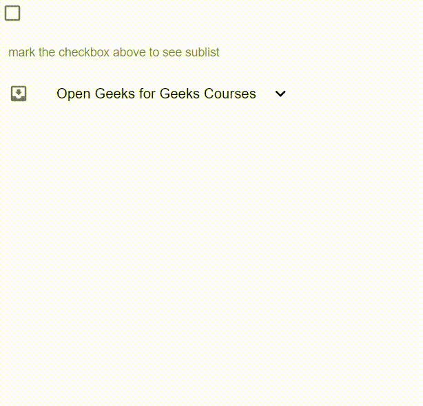
Output: Now open your browser and go to http://localhost:3000/, you will see the following output.
Reference : https://mui.com/material-ui/react-list/