 |
VOOZH | about |
|
VOOZH | about |
A React Bootstrap Close Button Component is a generic close button for dismissing content such as modals and alerts. You can use it to provide an option to close or hide a component with a simple click. You can customize its appearance and behavior with props such as variant, aria-label, onClick, and disabled.
Attributes:
Step 1: Create a React application using the following command.
npx create-react-app foldernameStep 2: After creating your project folder i.e. foldername, move to it using the following command.
cd foldernameStep 3: After creating the ReactJS application, Install the required modules using the following command.
npm install react-bootstrap bootstrapStep 4: Add the below line in the index.jsx or App.jsx file.
import 'bootstrap/dist/css/bootstrap.min.css';Example: Below is the practical implementation of the bootstrap close button component:
Step to Run Application:
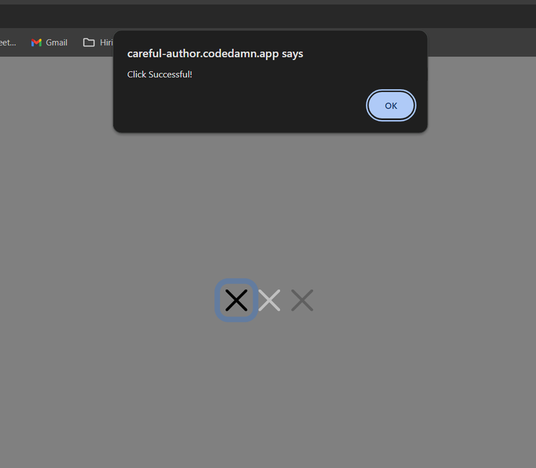
npm startOutput: Go to http://localhost:3000/, and you will see the following output.