 |
VOOZH | about |
|
VOOZH | about |
Material-UI is a user interface library that provides predefined and customizable React components for faster and easy web development, these Material-UI components are based on top of Material Design by Google. In this article, we will discuss the z-index in the Material-UI library.
To control the layout we use a z-index which gives a third axis to arrange content. z-index CSS property in Material-UI is designed to layer drawers, modals, snackbars, tooltips, etc in a proper way.
Syntax:
<Box sx={{ zIndex: 'tooltip' }}>
Here Box can be any other component.
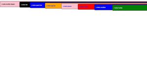
These are the default values set in mui in z-index:
These default values can be changed but it is not recommended. If you change one, you have to change them all.
Installing React App:
Step 1: Create a React app using the following command.
npx create-react-app example_zindex
Step 2: Now get into the project directory
cd example_zindex
Installing Material-UI: Installing Material-UI’s source files via npm/yarn, and they take care of injecting the CSS needed.
npm install @material-ui/core
OR
yarn add @material-ui/core
Project Structure: It will look like the following.
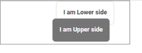
Example 1: In this example, we will see the basic example which explains how components will render based on their z-Index value.
Output:
Example 2: In this example, we will see examples of all the default values of the z-index.
Output:
Reference: https://mui.com/material-ui/customization/z-index/