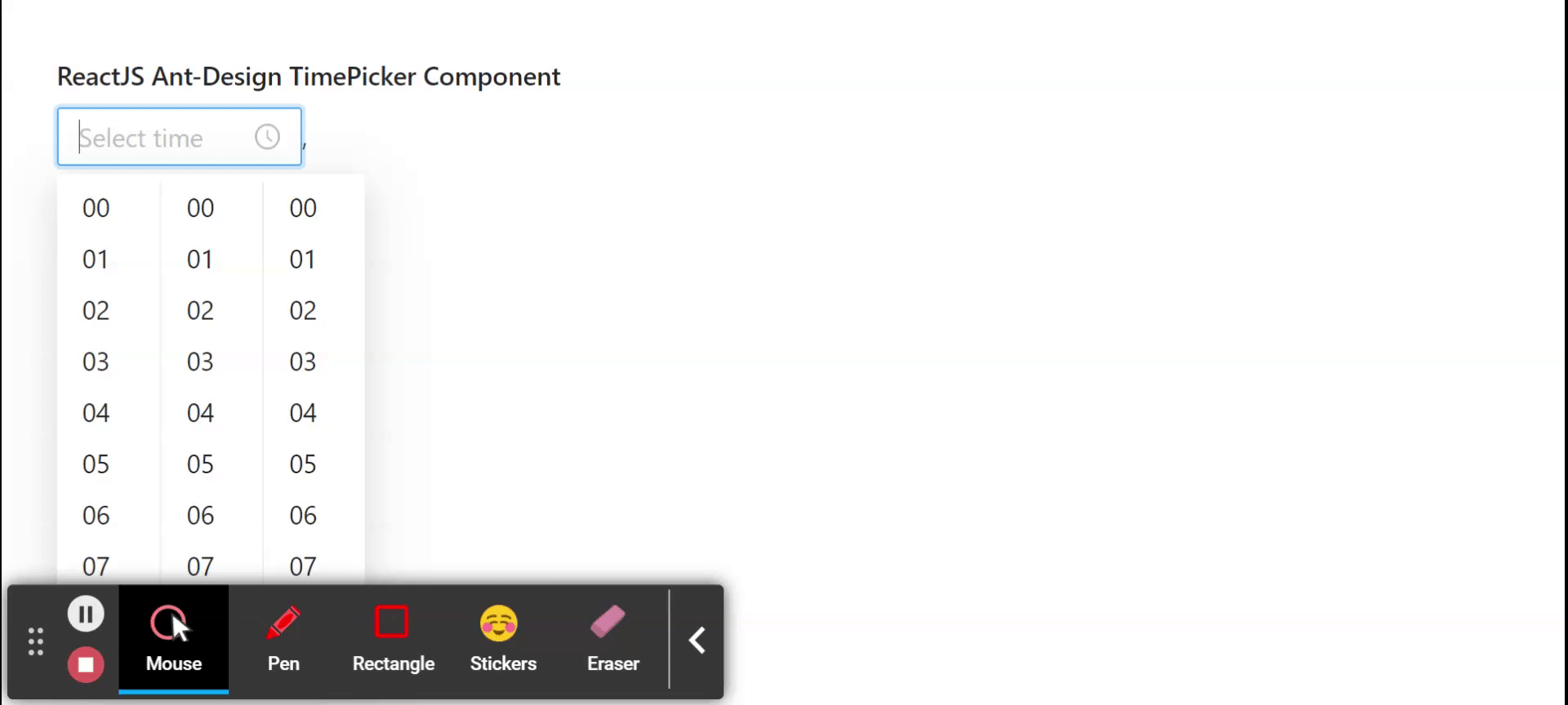
Ant Design Library has this component pre-built, and it is very easy to integrate as well. TimePicker Component is used to select a time from a popup panel when the user clicks on the input box. We can use the following approach in ReactJS to use the Ant Design TimePicker Component.
TimePicker Props:
allowClear: It is used to indicate whether allow clearing text or not.
autoFocus: It is used to get the focus when component mounted if this is set to true.
bordered: It is used to indicate whether it has border style or not.
className: It is used to pass the className of picker.
clearIcon: It is used for the custom clear icon.
clearText: It is used for the clear tooltip of icons.
defaultValue: It is used to set default time.
disabled: It is used to determine whether the TimePicker is disabled or not.
disabledHours: It is used to specify the hours that cannot be selected.
disabledMinutes: It is used to specify the minutes that cannot be selected.
disabledSeconds: It is used to specify the seconds that cannot be selected.
format: It is used to set the time format.
getPopupContainer: It is used to set the container of the floating layer.
hideDisabledOptions: It is used to indicate whether hide the options that can not be selected or not.
hourStep: It is used to denote the interval between hours in the picker.
inputReadOnly: It is used to set the read-only attribute of the input tag.
minuteStep: It is used to denote the Interval between minutes in the picker.
open: It is used to indicate whether to popup panel or not.
placeholder: It is used to display the placeholder when there's no value.
popupClassName: It is used to pass the className of the panel.
popupStyle: It is used for the style of panel.
renderExtraFooter: This function is called from the time picker panel to render some addon to its bottom.
secondStep: It is used to denote the interval between seconds in the picker.
showNow: It is used to indicate whether to show the Now button on the panel or not.
suffixIcon: It is used for the custom suffix icon.
use12Hours: It is used to display time in 12 hours format.
value: It is used to set time.
onChange: It is a callback function that is triggered when the selected time is changing function.
onOpenChange: It is a callback function that is triggered while panel opening/closing.
onSelect: It is a callback function that is triggered when a value is selected.
Methods:
blur(): This method is used to remove the focus.
focus(): This method is used to get the focus.
RangePicker Props:
order: It is used to order the start and end times.
Creating React Application And Installing Module:
Step 1: Create a React application using the following command:
npx create-react-app foldername
Step 2: After creating your project folder i.e. foldername, move to it using the following command:
cd foldername
Step 3: After creating the ReactJS application, Install therequiredmodule using the following command:
npm install antd
Project Structure: It will look like the following.
