 |
VOOZH | about |
|
VOOZH | about |
Flexbox, short for Flexible Box Layout, is a one-dimensional layout method for aligning and distributing space among items in a container. It allows you to design layouts that adapt to different screen sizes, making it ideal for responsive web design.
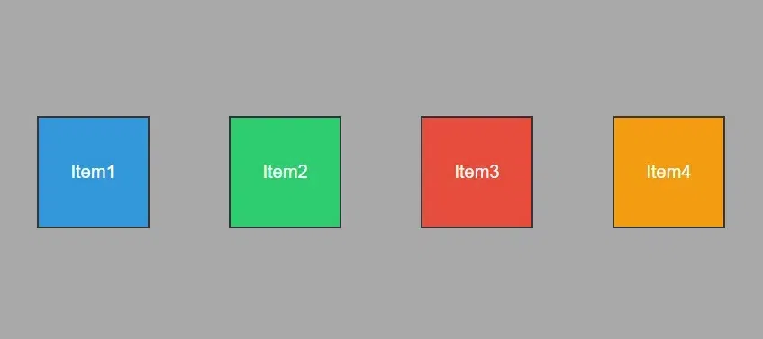
Flexbox allows you to easily create flexible layouts that adjust to different screen sizes. With properties like display, flex-direction, and justify-content, you can control the arrangement of elements in rows or columns.
The Flexbox Properties can be implemented to Parent element or the Child element, i.e. the various CSS Flex Properties can be applied to the flex container and the flex items.
Property | Descriptions | Syntax |
|---|---|---|
| display | Specifies the type of box used for an HTML element (block or inline). | .container { display: flex; } |
| flex-direction | Determines the primary axis direction for flex container layout. | .container { display: flex; flex-direction: row | row-reverse | column | column-reverse; } |
| flex-wrap | Controls whether flex items are forced onto one line or can wrap onto multiple lines. | .container { display: flex; flex-wrap : nowrap | wrap | wrap-reverse; } |
| justify-content | Aligns flex items along the main axis, distributing space between or around them. | .container { display: flex; justify-content: flex-start | flex-end | center | space-between | space-around| space-evenly; } |
| align-self | Overrides the default alignment for a specific flex item within the container. | .container{ align-self: center; } |
| align-items | Align flex items along the cross-axis within the container. | .container { align-items: stretch | flex-start | flex-end | center | baseline; } |
| align-content | Aligns lines of flex items along the cross-axis when multiple lines are present. | .container { display: flex; align-content: flex-start | flex-end | center | space-between | space-around | stretch; } |
| flex-grow | Defines the ability of a flex item to grow proportionally within the flex container. | .item1 { flex-grow: 1; } |
| flex-shrink | Determines the ability of a flex item to shrink proportionally within the flex container. | .item { flex-shrink: 3; // default is 1 } |
| flex-basis | Specifies the initial size of a flex item along the main axis. | .item { flex-basis: <length> | auto | content; // default is auto } |
The display property in CSS defines how the components(div, hyperlink, heading, etc) are going to be placed on the web page. As the name suggests, this property is used to define the display of the different parts of a web page.
Property | Descriptions | Syntax |
|---|---|---|
| display: flex; | The property applies to the container, makes the container a block element, and enables a flex context for all its direct children | .container { display: flex; } |
| display: inline-flex; | The display: inline-flex; works in a similar way. It only creates a container that's an inline element. | .container { display: inline-flex; } |
The flex-direction is a CSS property that defines the primary axis of a flex container, determining the direction in which its flex items are placed.
Property | Descriptions | Syntax |
|---|---|---|
| row | Arrange items in a horizontal row, default direction. | flex-direction: row; |
| row-reverse | Arrange items in a horizontal row but in the reverse order. | flex-direction: row-reverse; |
| column | Arrange items in a vertical column. | flex-direction: column; |
| column-reverse | Arrange items in a vertical column but in the reverse order. | flex-direction: column-reverse; |
The flex-wrap is a CSS property used in flex containers to control whether the flex items should wrap to a new line or stay on the same line.
Property | Descriptions | Syntax |
|---|---|---|
| wrap | Items are wrapped onto multiple lines, and arranged from top to bottom. | .container { display: flex; flex-wrap: wrap; } |
| nowrap | All flex items are arranged on a single line. | .container { display: flex; flex-wrap: nowrap; } |
| wrap-reverse | It repositions flex items onto multiple lines, wrapping from bottom to top. | .container { display: flex; flex-wrap: wrap-reverse; } |
justify-content property
The justify-contentis a CSS property in flex containers that aligns flex items along the main axis. It determines how extra space is distributed.
Property | Descriptions | Syntax |
|---|---|---|
| flex-start | Align items to the start of the container. | justify-content: flex-start; |
| flex-end | Align items to the end of the container. | justify-content: flex-end; |
| center | Centers items along the horizontal axis. | justify-content: center; |
| space-between | Items are evenly distributed with the first at the start and the last at the end. | justify-content: space-between; |
| space-around | Distributes items evenly with equal space around them. | justify-content: space-around; |
| space-evenly | Provides equal space around items, including at the start and end. | justify-content: space-evenly; |
align-items property
The align-items is a CSS property used in flex containers to define how flex items align along the cross-axis.
| Property | Descriptions | Syntax |
|---|---|---|
| stretch | Stretches items to fill the container along the cross-axis. | align-items: stretch; |
| flex-start | Align items to the start of the container cross-axis. | align-items: flex-start; |
| flex-end | Align items to the end of the container cross-axis. | align-items: flex-end; |
| center | Centers items along the container's cross-axis. | align-items: center; |
| baseline | Items are aligned to the baseline of the container. | align-items: baseline; |
align-content property
The align-content is a CSS property applied to flex containers to control the alignment of lines along the cross axis when there's extra space.
| Property | Descriptions | Syntax |
|---|---|---|
| stretch | Fills the available space, making lines stretch. | align-content: stretch; |
| flex-start | Packs lines at the start of the container. | align-content: flex-start; |
| flex-end | Packs lines at the end of the container. | align-content: flex-end; |
| center | Centers lines within the container. | align-content: center; |
| space-between | Evenly distributes lines, starting from the container's beginning to the end. | align-content: space-between; |
| space-around | Evenly distributes lines with equal space around them. | align-content: space-around; |
The align-content property is effective when two criteria are fulfilled:
The following are the list of properties that can be applied to the flex items.
| Property | Descriptions | Syntax |
|---|---|---|
| order | Specifies the order in which the flex items appear within the container. Its default value is 0 and if value is -1 then it makes the last element to item element. | order: <integer>; |
| flex-grow | Determines the ability of a flex item to grow relative to others. It determines the ability of a flex item to grow relative to others. | flex-grow: <number>; |
| flex-shrink | Defines the ability of a flex item to shrink relative to others. The flex-shrink property won’t work if the flex container has the flex-wrap: wrap; property. The default value is 1. The value 0 allows keeping the item’s original size. Negative numbers are invalid. The flex property is the shorthand for flex-grow, flex-shrink, and flex-basis combined. Note: .item1 { flex: 1 1 20em; } // flex-grow, flex-shrink, and flex-basis | flex-shrink: <number>; |
| flex-basis | Establishes the initial size of a flex item. The "content" keyword flex-basis signifies sizing based on the item's content, while the "auto" keyword indicates that the size should be determined by the width or height property of the element, previously handled by the now-deprecated "main-size" keyword. | flex-basis: <length> |
| flex | Shorthand property combining flex-grow, flex-shrink, and flex-basis. | flex: none |
| align-self | Overrides the align-items value for a specific flex item. | align-self: auto |
In CSS Media Queries, you learned how to make your website look good on all sorts of screens and devices. By using media queries, you can create layouts that adjust nicely whether someone's using a big computer monitor or a small smartphone screen. It's like making sure your website looks awesome everywhere!
Syntax
.main {
 display: flex;
 flex-wrap: wrap;
 justify-content: space-around;
 padding: 20px;
}
// Responsive layout - makes a one column
// layout instead of a three-column layout
@media (max-width: 768px) {
 main {
 flex-direction: column;
 }
}
Explanation:
.webp)