 |
VOOZH | about |
|
VOOZH | about |
Primer CSS is a free open-source CSS framework that is built upon systems that create the foundation of the basic style elements such as spacing, typography, and color. This systematic method makes sure our patterns are steady and interoperable with every other.
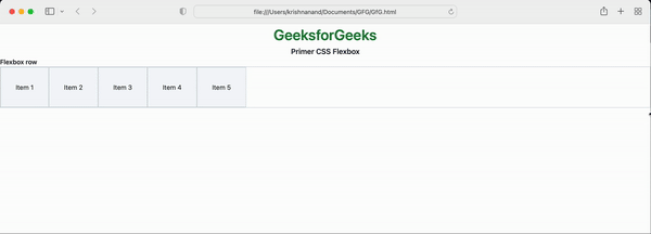
Flexbox is the flexible box that will change this size according to the resolution of the screen.
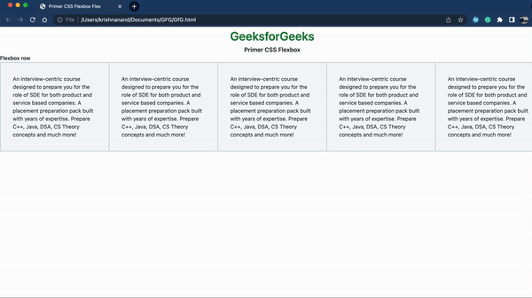
Flexbox bug is when you perform some task and the output is keep changing when you switch the browser. For example, if you are running the code on chrome then it is giving output not the same as when you run the same code on safari.
We will now discuss two major bugs when we use flexbox.
Example 1:
Output:
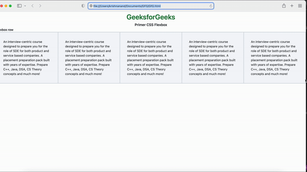
Example 2:
Output:
Reference: https://primer.style/product/css-utilities/#flexbox-bugs