 |
VOOZH | about |
|
VOOZH | about |
Primer CSS is a free open-source CSS framework that is built with the GitHub design system to provide support to the broad spectrum of Github websites. It creates the foundation of the basic style elements such as spacing, typography, and color. This systematic method makes sure our patterns are steady and interoperable with every other. Its approach to CSS is influenced by Object-Oriented CSS principles, functional CSS, and BEM architecture. It is a highly reusable model.
Primer CSS framework provides layouts that can be changed using utilities like display, visibility, position, alignment, float, overflow, width, and height. In this article, we will learn to implement various width and height utilities for layout documents.
Primer CSS Layout width and height classes:
Syntax:
<div class="Layout width and height class"> ...</div>
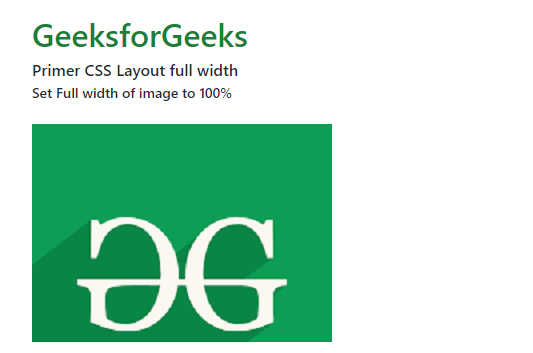
Example 1: The following example demonstrates the width-fit class to set max-width 100% for an image resource.
Output:
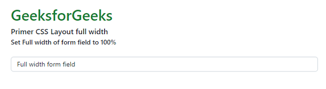
Example 2: The following example demonstrates the width-fit class to set the width to 100% for a form field.
Output:
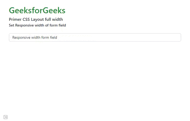
Example 3: The following example demonstrates the width-full and width-md-auto class to set a responsive form field.
Output:
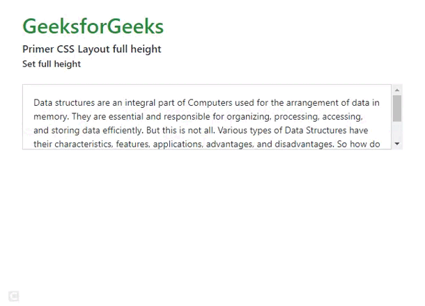
Example 4: The following example demonstrates the height-fit class to set max-height 100% for an HTML div.
Output:
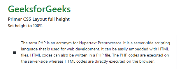
Example 5: The following example demonstrates the height-full class to set the height to 100% for an HTML div.
Output:
Reference: https://primer.style/product/css-utilities/#width-and-height