 |
VOOZH | about |
|
VOOZH | about |
Primer CSS is a free open-source CSS framework built on principles that establish the foundation for basic design elements including spacing, typeface, and color. Our patterns will be consistent and compatible as a result of this method. Its CSS approach is influenced by object-oriented CSS concepts, functional CSS, and BEM architecture. It's incredibly adaptable and reusable. It was created with the help of the GitHub design system. Primer CSS is self-explanatory and transparent.
In this article, we will be knowing in detail about the Select Menu in Primer CSS. Primer CSS Select menu is used to make different types of menus. It also provides us with a lot of functionalities like adjusting the layout, selecting the menu, adding a header and footer, adding a divider, using a filter, etc.
Primer CSS Select Menu:
Syntax:
<div class="SelectMenu right-[0-12] SelectMenu--hasFilter">
 <div class="SelectMenu-modal">
 <div class="SelectMenu-list SelectMenu-list--borderless">
 <button class="SelectMenu-item">...</button>
 <div class="SelectMenu-divider">...</div>
 <button class="SelectMenu-item">...</button>
 <svg class="SelectMenu-icon SelectMenu-icon--check"></svg>
 ...
 <button class="SelectMenu-message">...</button>
 </div>
 </div>
 <footer class="SelectMenu-footer">...</footer>
</div>
Right-aligned Select Menu: The main important step to having a right-aligned menu is to make the whole container holding the select menu a flex container.
Primer CSS does not give us the functionality which we can use to change the aria-checked attribute dynamically. For that, we can use some client-side scripting language and add the functionality which will change the value to toggle the visibility of the icon before the item of the menu whenever the item will be clicked on.
The disabled attribute can be added to the buttons of the select menu which will define that button in the menu is disabled and cannot be used.
For anchor tags, the value of the aria-disabled is given as true to keep it disabled.
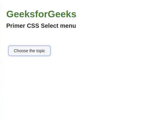
Example 1: The code below demonstrates the usage of the Selected State of the Select Menu.
Output:
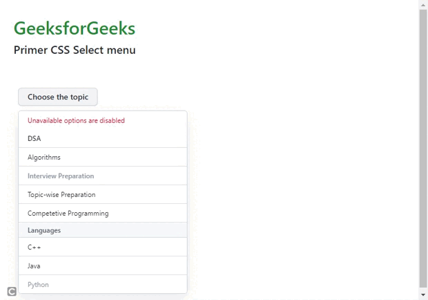
Example 2: This code below demonstrates the usage of the message, disabled state, and divider.
Output: