 |
VOOZH | about |
|
VOOZH | about |
Flutter FlatButton Class has been officially deprecated and should not be used. We can use TextButton class instead to achieve the same results. In the example below we have code that uses the TextButton class to achieve the same results as that of its deprecated counterpart (i.e. FlatButton).
FlatButton class comes with a simple text button class that is used in the majority of the application. They are deprecated with no elevation and mostly have a text widget or an icon widget as their child. There is no styling available in the entire flat button class. The text color for black by default whereas the background color is blue. TextButtons are the new un-deprecated replacement for deprecated Flat Buttons. It is imported from "package:flutter/material.dart". The theming of this class is done with the help of Button functionalities you can use for viewing all files of Gallery, opening Camera, changing permissions, etc.
FlatButton(
 {Key key, @
 required VoidCallback onPressed,
 VoidCallback onLongPress,
 ValueChanged<bool> onHighlightChanged,
 MouseCursor mouseCursor,
 ButtonTextTheme textTheme,
 Color textColor,
 Color disabledTextColor,
 Color color,
 Color disabledColor,
 Color focusColor,
 Color hoverColor,
 Color highlightColor,
 Color splashColor,
 Brightness colorBrightness,
 EdgeInsetsGeometry padding,
 VisualDensity visualDensity,
 ShapeBorder shape,
 Clip clipBehavior: Clip.none,
 FocusNode focusNode,
 bool autofocus: false,
 MaterialTapTargetSize materialTapTargetSize,
 @required Widget child})
}
This class comes with a number of properties, the most commonly used ones are described below:
Color: defines the color of the button.
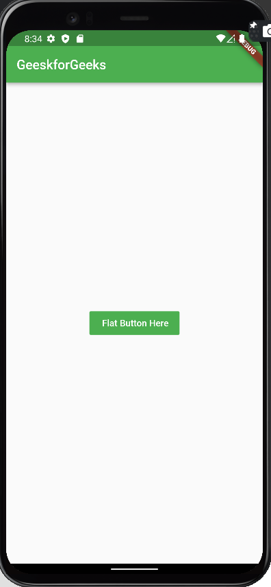
FlatButton(
 color: Colors.green,
 onPressed: () {},
 child: Text(
 ' Flat Button Here',
 style: TextStyle(
 color: Colors.white,
 ),
 ),
),Output:
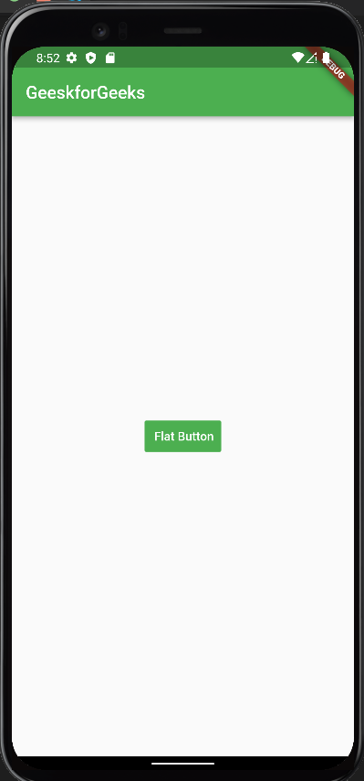
padding: defines the spacing between the text and the border.
FlatButton(
 color: Colors.green,
 padding: const EdgeInsets.all(5),
 onPressed: () {},
 child: const Text(
 ' Flat Button',
 style: TextStyle(
 color: Colors.white,
 ),
 ),
),Output:
splash color: defines the highlighted color when hovered.
 FlatButton(
 color: Colors.green,
 padding: const EdgeInsets.all(5),
 splashColor: Colors.yellow,
 onPressed: () {},
 child: const Text(
 ' Flat Button',
 style: TextStyle(
 color: Colors.white,
 ),
 ),
 ),
Output:
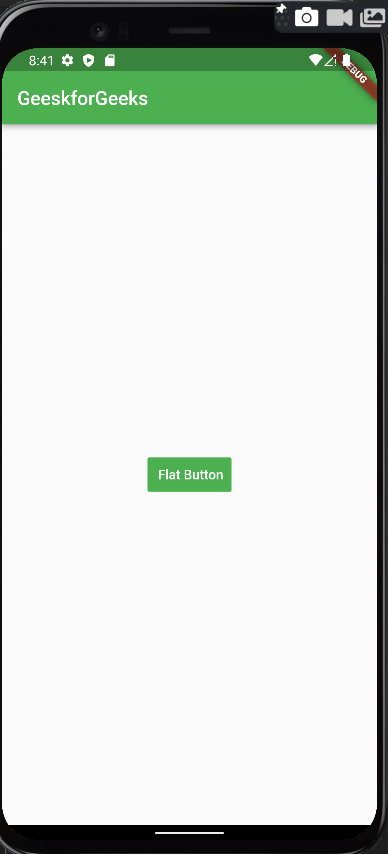
textcolor: defines the color of the text inside the button.
FlatButton(
 color: Colors.green,
 textColor: Colors.white,
 onPressed: () {},
 child: const Text(
 ' Flat Button',
 ),
 ),
Output:
height: defines the height of the button
FlatButton(
 color: Colors.green,
 height: 5,
 textColor: Colors.white,
 splashColor: Colors.yellow,
 onPressed: () => Navigator.of(context)
 .push(MaterialPageRoute(builder: (context) => const NewScreen())),
 child: const Text('Flat Button'),
 ),
Output:
onPressed: defines the callback value for the button i.e. the action to be performed when the user clicks the button.
FlatButton(
 color: Colors.green,
 textColor: Colors.white,
 splashColor: Colors.yellow,
 onPressed: () => Navigator.of(context)
 .push(MaterialPageRoute(builder: (context) => const NewScreen())),
 child: const Text('Flat Button'),
 ),
Here onPressed() is executing a function that takes the control to a new screen.
Output:
Apart from these, there are many other properties as well but these are only used in the majority of applications.
Let's understand a flat button class with the help of examples.
Output: