 |
VOOZH | about |
|
VOOZH | about |
TextButton is a built-in widget in Flutter which derives its design from Google’s Material Design Library. It is a simple Button without any border that listens for onPressed and onLongPress gestures. It has a style property that accepts ButtonStyle as value, using this style property developers can customize the TextButton however they want.
const TextButton({
 Key? key,
 required void Function()? onPressed,
 void Function()? onLongPress,
 void Function(bool)? onHover,
 void Function(bool)? onFocusChange,
 ButtonStyle? style,
 FocusNode? focusNode,
 bool autofocus = false,
 Clip clipBehavior = Clip.none,
 required Widget child,
})
Property | Description |
|---|---|
onPressed | (required) This property takes a Function that returns void. That function will be invoked whenever the TextButton is pressed. |
onLongPress | This property also takes a Function that returns void. That function will be invoked whenever the TextButton is long-pressed. |
onHover | onHover property takes a void Function that takes a boolean value as its only parameter. The passed parameter is true if a pointer entered the button response area and is false when a pointer leaves the button response area. |
onFocusChange | onFocusChange property also takes a void Function that takes a boolean value as its only parameter. The passed parameter is true if the button gains focus and is false if the button loses focus. |
style | This optional property accepts ButtonStyle as an object. It is used for customizing the look of the TextButton. |
focusNode | An optional focus node to use as the focus node for TextButton. |
autofocus | Pass true if you want this widget as the initial focus when no other node in its scope is currently focused. The default value is false. |
clipBehaviour | Accept the value of the type Clip enum. The default value is Clip.none. |
child | (required) The child widget of TextButton Widget. |
Example 1: In the example below, we used TextButton's onPressed property to launch the URL when we press the TextButton.
Output:
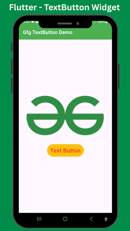
Example 2: In this example, we used TextButton's style property to change the style of the text button.
Output: