 |
VOOZH | about |
|
VOOZH | about |
Buttons are material components that provide the user a single tap facility for taking actions, making choices, submitting forms, saving data, opening a new page, etc. Buttons are triggered when the user taps on them. They are the most commonly used feature provided in almost all Flutter apps. For using buttons, you need to import the Material Components package for Flutter, i.e., "package:flutter/material.dart". Based on their classification, buttons are divided into two categories - deprecated and non-deprecated. The button works on material apps only.
Special features of a Button
Buttons are classified broadly into the following categories:
Given below is a brief description of each of the categories:
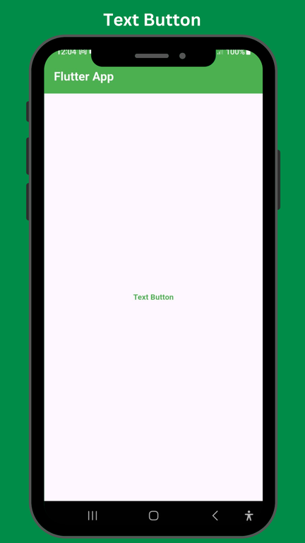
1. Text Button
The simplest of all the buttons is a text button. They are regular text without any outline or boundary.
Example:
Output:
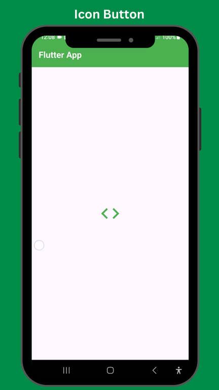
2. Icon Button
These are picturized buttons with colors filled inside them. Icon Buttons represent a cartoonish image of the category defined inside. These are used to create profile screens, option tabs, etc.
Example:
Output:
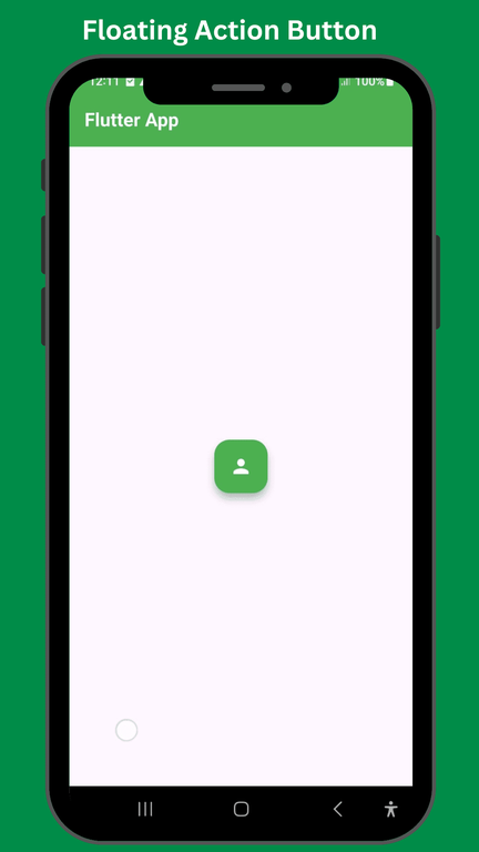
3. Floating Action Button
These are small circular buttons that hang on the screen of the application. You can set the position of your action button by using but by default, it is placed at the center of the screen. They create a hovering effect when tapped.
Example:
Output:
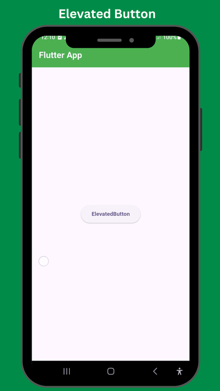
4. Elevated Button
This button has a special feature of increased elevation. When an elevated button is pressed, its elevation is increased to a certain value. They do not offer straightforward styling like the rest of the buttons, but you can use a styleFrom method to style an elevated button explicitly.
Example:
Output:
5.Drop Down button
These buttons provide an option to choose from a list of available options. It is a drop-down list.
Example:
Output:
6. Pop Up Menu Button
It is represented by three vertical dots. It displays a menu bar from which the user selects their chosen option.
Example:
Output:
Given below are the basic steps you always need to perform while creating a button.
Example:
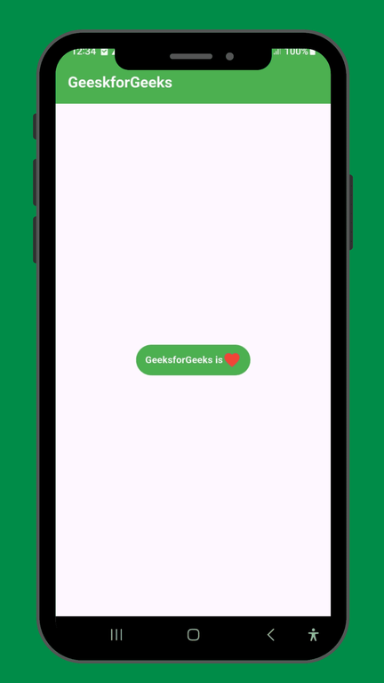
Suppose you want to create a raised button that has an icon of a favorite titled alongside "GeeksforGeeks is" as text.
Implementation:
Output: