 |
VOOZH | about |
|
VOOZH | about |
Adding a text shadow in Tailwind CSS is useful for making text for creating visual effects like glows and embossed or debossed effects. Tailwind CSS does not provide text shadow utilities out of the box but it allows you to easily extend its functionality to add custom utilities. In this article, we will explore how to add a text shadow in a project using Tailwind CSS.
tailwind.config.js file to include a custom plugin. Within this plugin, define the text-shadow styles you want to support, such as various shadow sizes and colors.npx create-react-app react-app
cd react-app
npm install -D tailwindcss postcss autoprefixernpx tailwindcss init -pmodule.exports = {
content: ["./src/**/*.{js,jsx,ts,tsx}"],
theme: {
extend: {
colors: {
primaryGreen: "#4CAF50", // Green
primaryBlack: "#000000", // Black
primaryWhite: "#FFFFFF", // White
}
},
},
plugins: [],
}
@tailwind base;
@tailwind components;
@tailwind utilities;

body {

 margin: 0;
 font-family: 'Times New Roman', Times, serif;
 -webkit-font-smoothing: antialiased;
 -moz-osx-font-smoothing: grayscale;
}

code {
 font-family: source-code-pro, Menlo, Monaco, Consolas, 'Courier New',
 monospace;
}
"dependencies": {
 "@testing-library/jest-dom": "^5.17.0",
 "@testing-library/react": "^13.4.0",
 "@testing-library/user-event": "^13.5.0",
 "react": "^18.3.1",
 "react-dom": "^18.3.1",
 "react-icons": "^5.3.0",
 "react-scripts": "5.0.1",
 "web-vitals": "^2.1.4"
 }
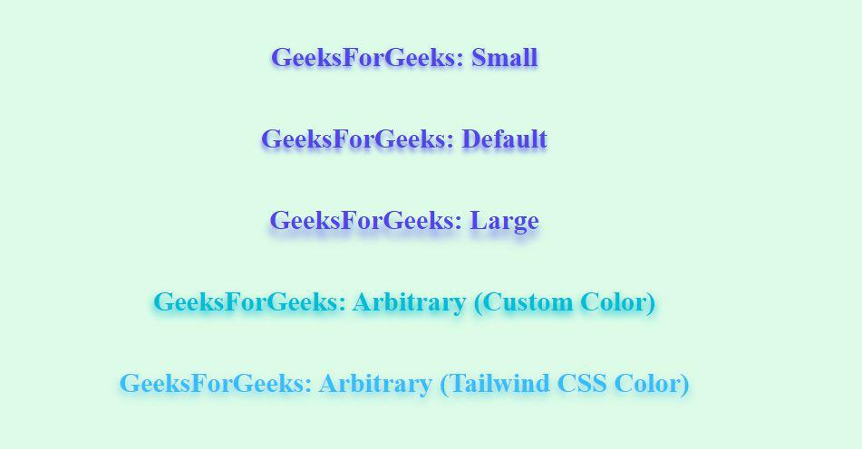
Example: This example demonstrates the creation of text shadow using React and Tailwind CSS
npm startOutput:
This article showcases the flexibility of Tailwind CSS and its extensibility through custom utilities such as adding text shadows. By extending the default configuration we can introduce new styling options that are not available out of the box. We also demonstrated how JavaScript can be integrated with Tailwind to dynamically manipulate styles and adding interactivity to a static webpage.