 |
VOOZH | about |
|
VOOZH | about |
Mastering data visualization is essential for understanding and presenting data in the best way possible and among the most commonly accessed libraries in Python are the data visualizations that are provided. This "Matplotlib Cheat Sheet" is structured in order to present a quick reference to some of the most widely used functions in Matplotlib along with one feature.
In this article, we will transform the data into compiling visual stories with Matplotlib Cheat-Sheet;
Table of Content
This powerful library of matplotlib creates almost every type of data visualization with simple line plots to complex 2D and 3D graphs. It is quite famous for data exploration and presentation purposes, providing wide customization scope on colors, labels, and layouts. Whether you are a beginner or pro, Matplotlib makes data visualization intuitive and efficient.
A Matplotlib cheat sheet is a concise guide that summarizes the key functions, commands, and techniques for creating visualizations using Matplotlib. It’s a handy reference for beginners and experienced users alike helping them quickly recall how to generate and customize plots, charts and graphs efficiently.
Download the Cheat-Sheet here- Matplotlib Cheat-Sheet
If you have Python and pip installed, you can install matplotlib by typing the following command:
Once python is installed, In your Python script you generally import the module pyplot from Matplotlib, which gives you a MATLAB-like interface for plotting:
Matplotlib offers a set of functions that can be used for creating different kinds of plots. These are some essential commands for basic plotting:
Command | Execution |
|---|---|
|
|
|
|
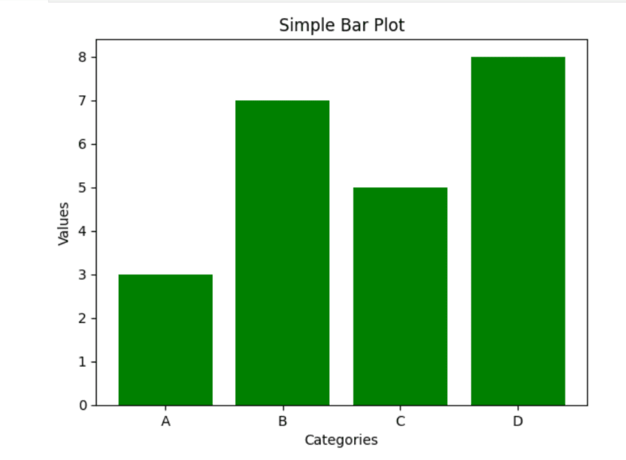
| Bar plot shows the distribution of data for a categorical variable. |
| A horizontal bar plot is a version of the bar plot with the bars going horizontally instead of vertically. |
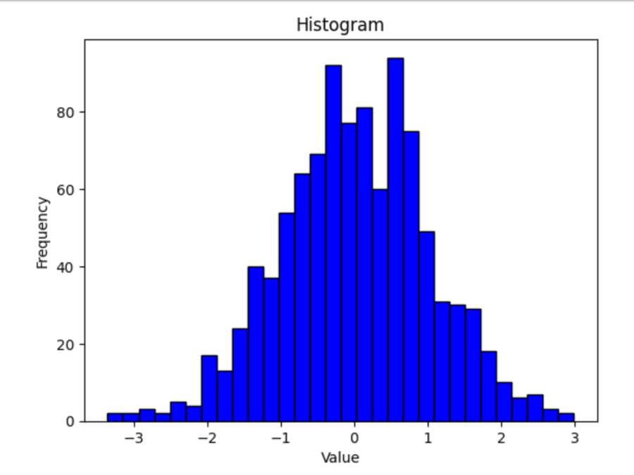
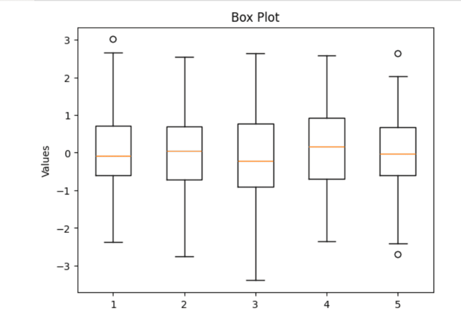
| Histogram useful for understanding frequency distribution in numerical data and picking up patterns such as skewness, outliers, or gaps. |
|
|
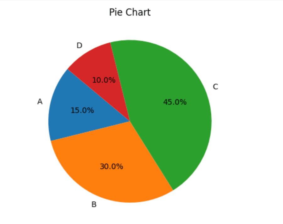
| A pie chart is a circular statistical graphic used to illustrate numerical data as slices of the whole. |
Matplotlib allows for great customization to make your plots more aesthetically pleasing and clearer. Here are some of the main commands for customizing different parts of your plot:
Command | Execution |
|---|---|
| Customizing titles in Matplotlib makes your visualizations clearer and aesthetically pleasing. |
| Customizing axis labels in Matplotlib helps in making your plots more readable and presentable. |
| Matplotlib's use of grids can make plots easier to read. |
| Matplotlib offers several styles to alter the look of your plots. |
| You can limit the range of your x-axis and y-axis in Matplotlib to concentrate only on a portion of your data. |
| Legends help in plotting interpretation because they explain each element presented to view in the graph. |
Subplots in Matplotlib enable you to develop more than one plot in the same figure which helps in a comparison and makes the data more understandable.
Command | Execution |
|---|---|
| The plt.subplot(nrows, ncols, index) function in matplotlib creates a grid of subplots. |
| We use the `plt.subplots()` function for creating multiple subplots. It returns a figure and an array of axes. |
Customizing subplots in Matplotlib makes your visualizations clear and aesthetically pleasing. Here are the key techniques to effectively customize them:
Command | Execution |
|---|---|
| For writing a general title that applies to all subplots of a figure using Matplotlib, you may use the function plt.suptitle(). |
| Use the plt.subplots_adjust() function to adjust the layout of subplots in Matplotlib. |
Matplotlib allows for a great degree of control over the plot's aesthetics by means of styles and style sheets.
Command | Execution |
|---|---|
| Changing the style of your plots in Matplotlib really helps make them much better looking and more readable. |
With Matplotlib, you can view as well as save plots. Let's take a look at the how to do that efficiently.
Command | Execution |
|---|---|
| In order to display a plot, use `plt.show()` following your plotting call. |
| You can save a plot to a file using the function plt.savefig(). |
Matplotlib offers many advanced features where users can plot very customized plots with professional-looking results. It provides more options to have complete control over the plots created and presents the data more effectively.
Command | Execution |
|---|---|
| Annotations in Matplotlib are used to add text or markers that explain something about a point in a plot. |
| Logarithmic scales are very important in Matplotlib for plotting data that ranges over several orders of magnitude. |
| Matplotlib is used for performing 3D plotting and visualizes data in three dimensions. |
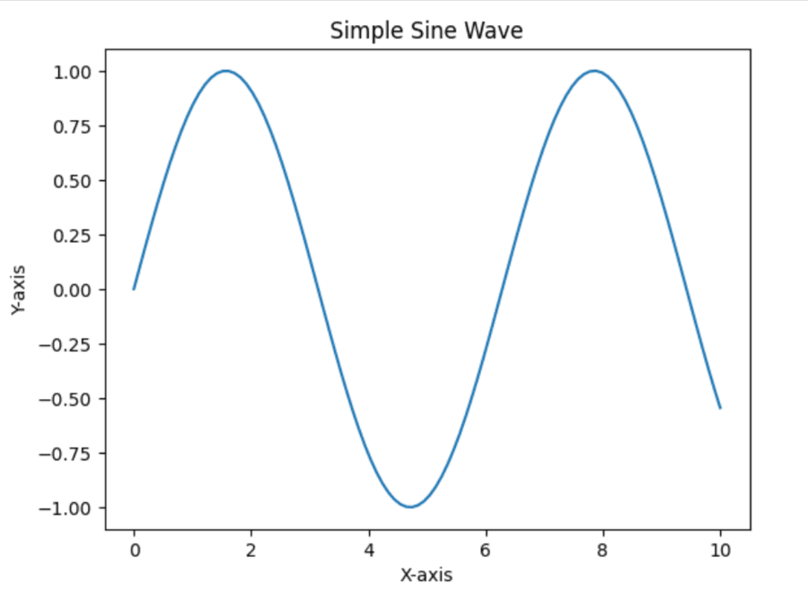
Output:
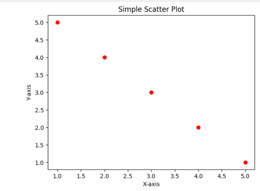
Output:
Output:
Output:
Output:
👁 dOutput:
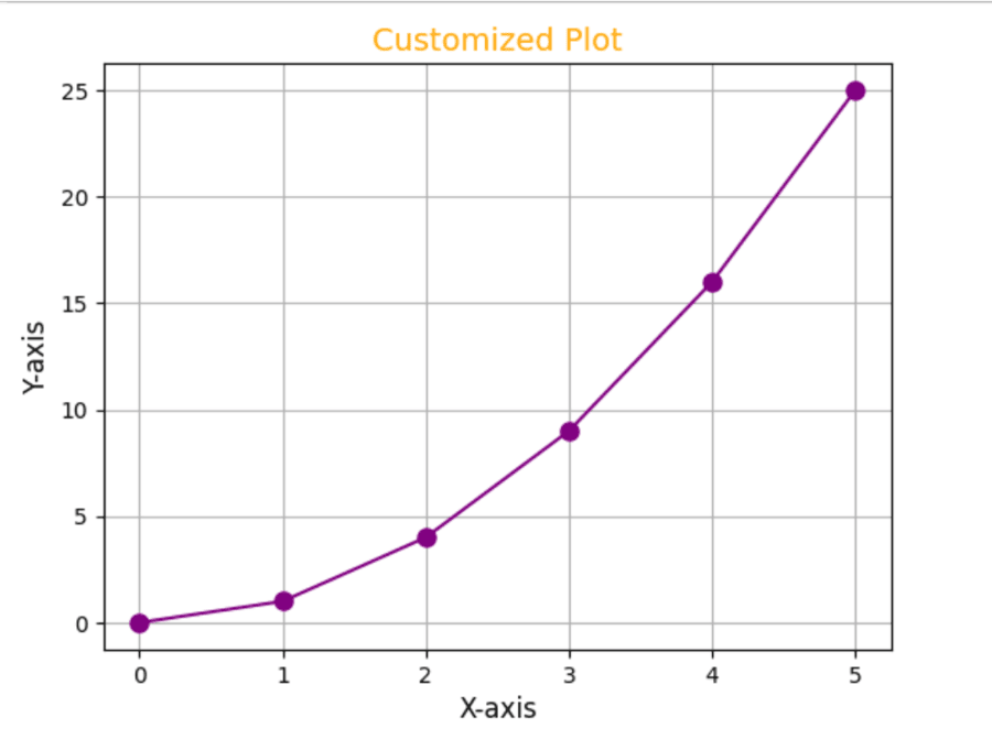
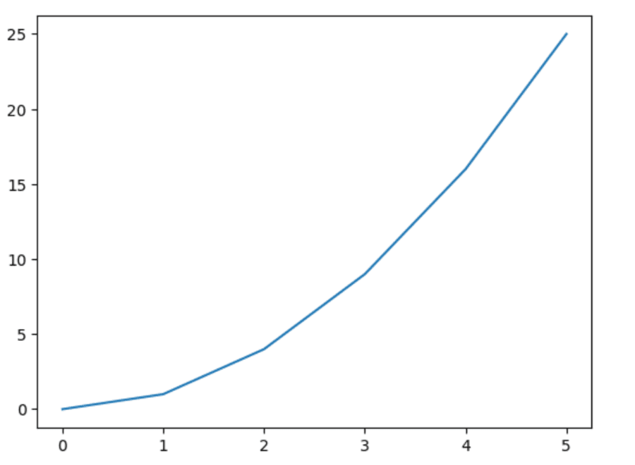
we can customizing plots by modifying titles, labels, colors and styles.
Output:
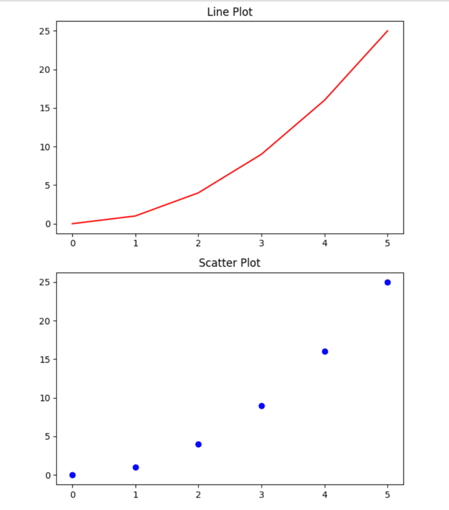
Matplotlib also provides the feature to plot several plots in a single figure by using subplots. This is very useful when one needs to compare different datasets side by side.
Output:
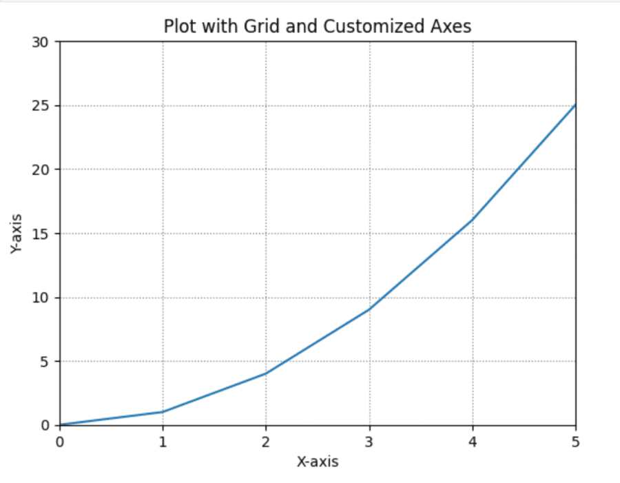
You can add grid and improve the readability of your plots.
Output:
Output:
The Matplotlib Cheat Sheet helps in creating different plots starting from line graphs up to pie charts. It facilitates users in efficient data visualization allowing them the choice of customization in presentations. The cheat sheet offers solutions to new users as well as seasoned ones; it streamlines the way of data visualization and makes the process easier while analyzing and presenting insights.