 |
VOOZH | about |
|
VOOZH | about |
Customizing plot labels in Pandas is an essential skill for data scientists and analysts who need to create clear and informative visualizations. Pandas, a powerful data manipulation library in Python, provides a convenient interface for creating plots with Matplotlib, a comprehensive plotting library. This article will guide you through the process of customizing plot labels in Pandas, covering various aspects such as axis labels, plot titles, and legends.
Table of Content
Pandas offers a simple and intuitive way to create various types of plots directly from DataFrames and Series. By leveraging Matplotlib as the default backend, Pandas allows users to generate line plots, bar plots, histograms, scatter plots, and more, with minimal code. The plot() method in Pandas is versatile and can be customized extensively to suit specific visualization needs.
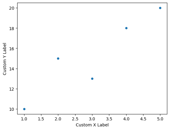
Axis labels are crucial for understanding the data being presented in a plot. In Pandas, you can set custom labels for the x-axis and y-axis using the xlabel and ylabel parameters. By default, Pandas will use the index name as the x-axis label and leave the y-axis label empty. Here's how you can set custom axis labels:
Output:
This code snippet demonstrates how to create a scatter plot with custom axis labels, enhancing the clarity of the plot.
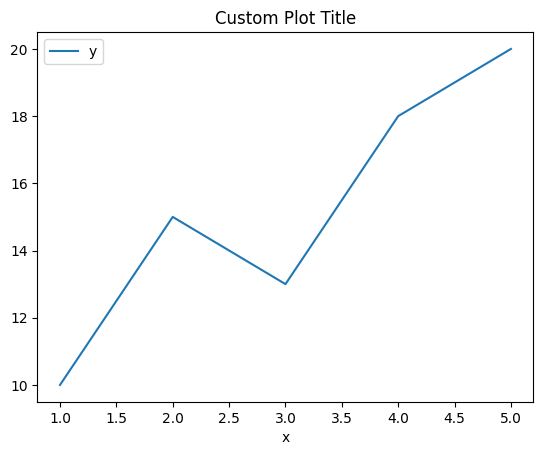
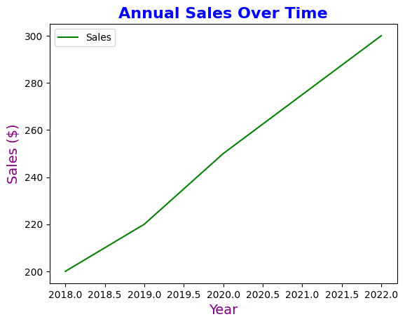
A plot title provides context and helps the viewer understand the purpose of the visualization. In Pandas, you can add a title to your plot using the title parameter within the plot() method or by using Matplotlib's plt.title() function. Here's an example:
Output:
Legends help in identifying different elements of a plot, especially in plots with multiple lines or categories. Pandas automatically adds a legend when necessary, but you can customize its appearance. In Pandas, you can customize legends by specifying labels and adjusting their placement. Here's how you can create and customize a legend:
Output:
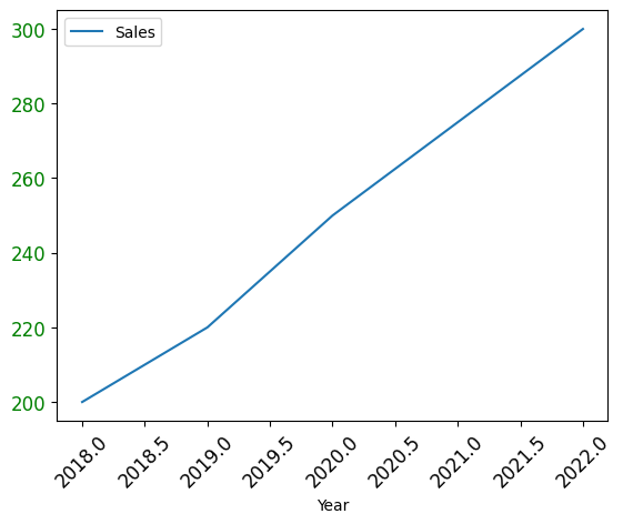
Tick Labels are the values that appear along the axes. Customizing them can help in making the plot more readable, especially when dealing with large or small numbers, dates, or categorical data.
Output:
Here, the x-ticks are rotated for better readability, and the y-tick labels are colored green.
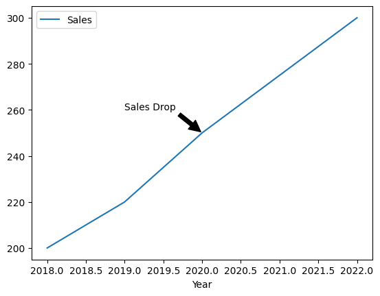
Annotations allow you to add text at specific data points on the plot. This is particularly useful for highlighting key events or outliers in the data.
Output:
Customizing line styles and markers can make your plot more visually distinct.
Output:
If you have a second data series that you want to compare on a different scale, you can add a secondary y-axis.
Output:
Customizing font sizes, styles, and colors for titles and labels can make your plot more polished.
Output:
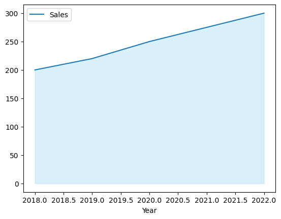
You can use fill_between() to shade the area under a curve, which is particularly useful for highlighting regions of interest.
Output:
The shaded area helps to visually emphasize the trend over time.
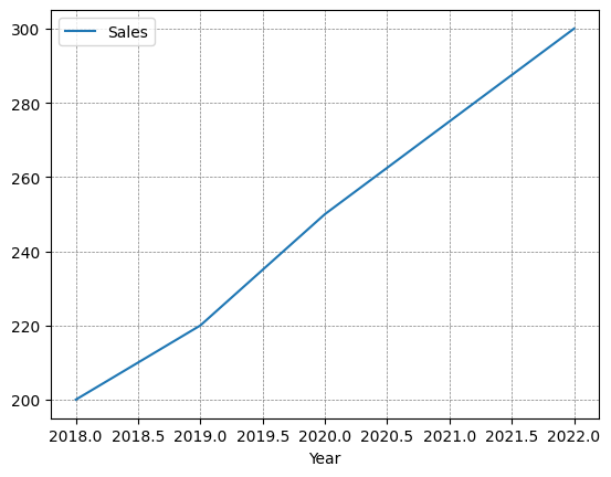
Adding gridlines can improve readability by making it easier to see where data points align on the axes.
df.plot(x='Year', y='Sales', grid=True)
plt.show()
You can also customize the appearance of gridlines:
Output:
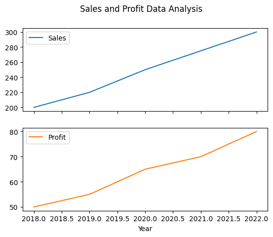
When working with multiple plots, customizing each subplot’s labels can enhance the clarity of the overall visualization.
Output:
Customizing plot labels in Pandas is an essential skill for creating clear, informative, and visually appealing data visualizations. Whether you are adding a title, customizing axis labels, adjusting tick marks, or adding annotations, these customizations help in effectively communicating the story behind your data. By leveraging both Pandas and Matplotlib, you can achieve a high degree of customization that meets your specific needs.